African Color Palette Guide 2026: From Marrakech Clay to Himba Ochre
By Essence of the Road Art · Published July 2026
This article contains affiliate links. If you buy through them, we may earn a small commission at no extra cost to you. We only feature pieces we would live with ourselves.
Ask Pinterest what 2026 looks like and it answers in color: the platform named Afrohemian decor its top home trend of the year, and its official 2026 palette — persimmon, cool blue, jade, plum noir — reads like a walk through an African market. The beige era is over. What replaces it is not random color, but color with a passport.
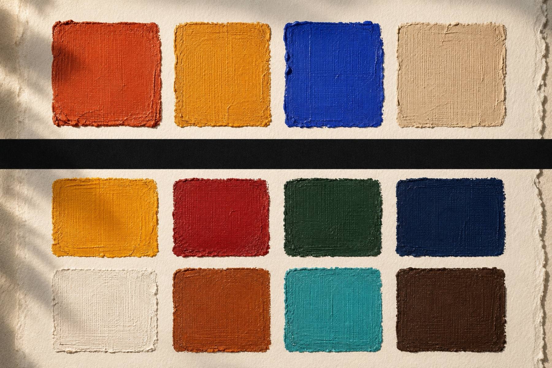
Here is the thing most trend reports leave out: every one of these colors is a made thing. Somebody dug the clay, fermented the mud, boiled the leaves, crushed the shell, or pressed the ochre into their palm. Before a color was a trend it was a chemistry, a season, a piece of geography you could hold. So this guide does two jobs at once. It gives you twelve signature palettes — one for each of twelve countries, with real hex codes and art to hang them — and for each one it tells you where the color actually comes from: the plant, the earth, the trade route, and the meaning the people who make it have carried for centuries.
We travel respectfully. These are homages built from observation and from the words of the makers themselves, not official color systems. Where a color carries specific cultural meaning, we say so.
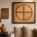
Quick answer: An african color palette is built from the colors of real places and real dyes — Marrakech terracotta clay, kente gold thread, indigo-fermented cloth, Maasai red ochre — arranged in a 60-30-10 balance of grounding neutral, saturated heritage color, and one deep or metallic accent. The fastest way to bring one home is a palette-matched art set such as our Africa Map Wall Art Set of 3 in Terracotta, which anchors a whole room’s scheme in three frames.
Table of Contents
Why African color palettes are the story of 2026
Two Pinterest signals converged this year. First, Afrohemian decor — African heritage meeting bohemian ease — became the platform’s most-watched interior trend, with searches up triple digits. Second, Pinterest’s 2026 color palette abandoned neutrals entirely: persimmon is Sahel clay by another name, cool blue has been dyed into West African indigo for nine centuries, and jade lives in every oasis courtyard in Marrakech.
In other words: the design world is arriving at colors African makers never left. Choosing an african color palette in 2026 is not chasing a trend — it is going to the source of one.
How this guide works
Every palette below follows the same anatomy, the one we teach in our Afro-Boho color palette guide: a grounding neutral (60%), one or two saturated heritage colors (30%), and a deep accent (10%). The hex codes are matched to real references — dyed cloth, painted walls, market stalls, ochre-rubbed skin — not to a paint fan deck. Screens vary, so treat each code as a compass rather than a contract. And under each palette you will find both an Etsy print that carries the colors and an Amazon piece to layer them in fabric or object.
1. Morocco — the Marrakech Souk palette
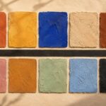
Terracotta #C1683C · Saffron #E0A526 · Majorelle blue #4B5CC4 · Warm sand #E8D5B5 · Charred clay #6E3B23
Where the color comes from. Marrakech is called the Red City for a literal reason: its walls are built and rendered in pisé, rammed earth pulled from the surrounding plain and tinted by iron-rich clay, so the whole city glows pink-orange at sunset. The saffron comes from the spice souks — pyramids of ground turmeric, paprika and true saffron. And the one shock of cobalt is Majorelle blue, a vivid ultramarine the painter Jacques Majorelle patented for his garden in the 1920s; it is modern pigment, but it has become as Moroccan as mint tea.
What it means and how it feels. This is a masterclass in warm-on-warm. Terracotta and sand carry the room; saffron lives in textiles; Majorelle blue appears once, deliberately, the way the city itself uses it. The impression is sun-baked calm with one jolt of energy.
Hang it: the Africa Map Wall Art Set of 3 in Terracotta or the softer Neutral Terracotta Botanical trio carry all five tones. Layer it: a set of terracotta and rust throw pillow covers. The full story — Fes leather, Chefchaouen blue and three more Moroccan palettes — is in our Moroccan color palette guide.
2. Ghana — the Kente Gold palette
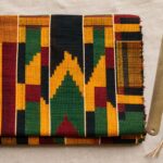
Kente gold #D9A404 · Red clay #9E3B26 · Forest green #2E5D3A · Black #1C1714 · Bone #EFE6D4
Where the color comes from. Kente is woven by the Asante and Ewe peoples on narrow strip looms, and historically its dyes were drawn from the forest itself — kola nut and clay for reds and browns, indigo and forest plants for the darker tones, with gold thread and yellow from bark and roots. Today the silk and cotton are often commercially dyed, but the code has not changed.
What it means and how it feels. In kente, color is language. Gold speaks of royalty and spiritual purity, green of growth and renewal, red of struggle and sacrifice, black of maturity and ancestral energy. A Ghana-inspired room borrows that grammar: gold as the celebration color, red clay and forest green held in balance, black used as punctuation rather than shadow. The impression is regal and warm — a room that feels dressed.
Hang it: our five-piece Adinkra Symbol Wall Art Set turns Sankofa and Gye Nyame into one gold-and-black statement, or the Geometric Africa Map Print in gold on dark. Layer it: a gold and black kente-print table runner. The full Accra-to-Gold-Coast journey is in our Ghana color palette guide.
3. Senegal — the Dakar Indigo palette
Indigo #2B3A67 · Faded denim blue #5C7599 · Sand #E3D6BE · Teranga warm brown #8C5B3F · Lake Retba pink #D98E9A
Where the color comes from. Indigo is one of the oldest dye traditions on the continent. It is not painted on — it is grown into cloth. Leaves of the indigo plant are fermented in a vat until the liquid turns a murky yellow-green; the cloth comes out that same green and then, as it meets the air, oxidizes before your eyes into deep blue. The accent, Lake Retba pink, is real geography: a salt lake north-east of Dakar whose brine algae turn it rose-pink.
What it means and how it feels. Senegal composes in blue the way Morocco composes in orange. Indigo sets the register; sand and teranga brown keep it human; the pink surprises. Teranga — the Wolof word for hospitality — is the mood: this is the calmest palette in the guide, which is exactly why it suits bedrooms and reading corners.
Hang it: the 18-piece Indigo Afrocentric bundle or the quieter Indigo Print Set of 3. Layer it: an indigo mudcloth-style throw pillow. Start with teranga, the Senegalese art of welcome.
The indigo here is the headline, but not the whole story — the full Senegal color palette sets it against sand, tile red and muted gold.
4. Tanzania — the Zanzibar Coast palette
Zanzibar turquoise #3E9C9C · Spice cinnamon #A8613A · Carved wood #4A342A · Coral white #F2E9DC · Kilimanjaro slate #5B6670
Where the color comes from. Swahili-coast color is the meeting of three histories: the Indian Ocean’s turquoise shallows, the cinnamon-and-clove trade that named the Spice Islands, and Zanzibar’s famous Stone Town doors, carved from near-black hardwood and studded with brass. The white is coral rag — the porous coral stone the old merchant houses are built from.
What it means and how it feels. Cool water tones plus warm spice is the rarest combination in this guide. It is the palette of a trading port: worldly, breezy, a little opulent. Use it where you want energy without heat — a sunroom, a bathroom, a bright kitchen.
Hang it: the Afrocentric Modern Beach Wall Art Set of 3 for the turquoise, or the Beige & Teal Abstract Africa Map for the cooler end. Layer it: a turquoise glazed ceramic vase. The full Stone-Town-to-savanna guide is in our Tanzania color palette guide.
5. Nigeria — the Yoruba Adire palette
Adire indigo #26355B · Resist white #EDE7D6 · Benin coral #B5473A · Brass gold #B8893C · Soft charcoal #2A2622
Where the color comes from. Adire is the Yoruba indigo-resist cloth of south-western Nigeria: women paint patterns in cassava-starch paste or stitch and tie the fabric, dip it in the indigo vat, and where the resist held, the cloth stays cream-white. The coral is deeper history — the Kingdom of Benin prized red coral beads, traded up from the coast, as the color of royalty and the Oba’s regalia; brass is the metal of its famous cast plaques.
What it means and how it feels. Blue-and-white with a jewel of coral red: it reads crisp and ceremonial. Indigo for depth and craft, white for breathing room, coral and brass for the flash of status. The impression is graphic and confident without being loud.
Hang it: the Indigo & Black Abstract Set of 3 for the adire base, warmed by the Abstract Golden Black Woman print. Layer it: a coral red velvet cushion cover.
Adire is only the opening move. The full Nigeria color palette breaks into five schemes — Yoruba adire, Aso-Oke heritage, Benin coral and brass, Lagos yellow, and full-volume Ankara — with the hex values for each.
6. Mali — the Bogolan Mudcloth palette
Mud black #33291F · Ochre yellow #C89A3C · Rust #9C5A34 · Bone white #EAE0CC · Deep umber #4A3625
Where the color comes from. This is the most literal palette in the guide — the color is made of earth. To make bògòlanfini, Malian artisans first soak cotton in a bath of pounded n’gallama tree leaves, which stains it yellow. Then they paint on patterns with fermented river mud, aged for up to a year in a clay jar. The iron oxide in the mud reacts with the tannin in the leaf-dyed cloth, and where mud meets cloth a permanent brown-black is born. Wash away the mud and the pattern stays — a color quite literally grown from the Niger riverbed.
What it means and how it feels. Every mudcloth pattern carries meaning — protection, proverbs, a woman’s passage into adulthood — and the palette is pure earth: charcoal, bone, ochre, rust. The impression is grounded, tactile, ancient. It is the natural backbone of the whole Afro-boho look.
Hang it: the Africa Map Textured Collage Print or the African Tribes cultural collage. Layer it: authentic black-and-white mudcloth throw pillow covers. Go deeper with our DIY mudcloth pillow tutorial.
7. South Africa — the Ndebele Geometric palette
Ndebele cobalt #2551A6 · Signal red #C42E2A · Marigold #F1B434 · Grass green #2F8E4F · Black outline #141414 · Chalk white #F4F1E9
Where the color comes from. Ndebele women have painted the outside walls of their homes for generations, and the tradition holds a real history: after the Ndzundza Ndebele lost their war against Boer settlers in the 1880s, the bold painted walls became a coded language of resilience and identity. The earliest pigments were natural — clay, ash, ochre and cow dung. In the twentieth century, bright commercial acrylics arrived, and the palette leapt to the electric primaries we know now: cobalt, red, yellow, green, edged in black on white.
What it means and how it feels. Red for love and unity, yellow for fertility, the whole wall an announcement — of a marriage, a status, a prayer. This is the boldest palette here, and it is not for the timid. Used in full it is jubilant; used as a single accent wall or one framed print, it electrifies a neutral room.
Hang it: the vivid Colorful Afrocentric Africa Map Poster or the Blue Abstract Set of 3. Layer it: a set of bold geometric color-block cushion covers.
8. Ethiopia — the Highland Habesha palette
Habesha white #F1ECE0 · Church gold #C79A2E · Deep crimson #8E2C2C · Fresco blue #33557A · Ebony #211C18
Where the color comes from. Ethiopia’s signature is habesha kemis, the hand-woven white cotton dress edged with the woven color band called tibeb. Against that white, the country’s color memory is the palette of its ancient rock-hewn churches: gilded halos, deep crimson robes and lapis-blue skies painted in centuries-old frescoes, all edged in ebony.
What it means and how it feels. White as ground, gold and crimson as sacred richness, blue as the heavens — this is quiet luxury with a spiritual weight. The impression is serene and elevated, like candlelight on old gold. It suits a formal living room or a meditative corner.
Hang it: the celestial Afrofuturist Black Woman print for the gold-on-blue, or the Afrofuturist Portrait pair. Layer it: a gold and burgundy velvet throw.
9. Egypt — the Nile & Lapis palette
Lapis blue #2C4A8C · Pharaoh gold #CBA135 · Faience turquoise #3FA4A0 · Papyrus sand #E4D3A8 · Kohl black #1A1712
Where the color comes from. No civilization systematized color like ancient Egypt. Blue came from lapis lazuli, traded thousands of miles from Afghanistan, and from Egyptian blue, the first synthetic pigment humans ever made — ground quartz, lime and copper, fired into a glassy blue. Turquoise came from faience, that same self-glazing ceramic; gold from the desert mines; black from kohl. These were not decoration — they were meaning, painted onto tombs to last forever.
What it means and how it feels. Blue for the Nile and the sky, gold for the sun and the eternal, turquoise for rebirth. It is the most opulent, most graphic palette in the guide — deep saturated blue against metallic gold. The impression is timeless drama; a little goes a long way.
Hang it: the Geometric Africa Map in gold on dark reads as lapis-and-gold, paired with the Indigo Africa Map Poster. Layer it: a navy and gold lapis-tone lumbar pillow.
10. Kenya — the Maasai Red palette
Maasai red #B12A2A · Ochre #B9772F · Indigo-black check #232A33 · Savanna gold #C9A44C · Bright cobalt #2C5AA0
Where the color comes from. Maasai red begins in the earth as ochre — iron-rich clay the Maasai have long used to decorate their bodies, hair and hides. When they shifted from animal skins to cotton, they rubbed the new white cloth with fat and red ochre so it would match, in color and texture, the hides they had always worn. That is the origin of the shúkà, the famous red checked blanket.
What it means and how it feels. Red is the favourite color and the most charged: bravery, unity, and blood — the life of the cattle at the center of Maasai life. Set against savanna gold and one bolt of cobalt from the beadwork, it is warm, vital and outdoorsy. The impression is energetic and earthy, perfect for a room that wants to feel alive.
Hang it: the Afrocentric Elephant print for savanna warmth, or the Black Woman, Tribal Mask & Africa Map Set of 3. Layer it: a genuine red Maasai shuka cloth throw blanket.
11. Namibia — the Himba Red Earth palette
Otjize red #A64B33 · Desert sand #DFC49B · Umber #6E4327 · Sky wash #9FB2BE · Char #2B2320
Where the color comes from. Among the Himba of northern Namibia, red is not on the wall — it is on the skin. Women make otjize, a paste of ground red ochre and butterfat, sometimes scented with aromatic omuzumba resin, and smooth it over their bodies and hair every day. It protects against the fierce desert sun and insects, and it is inseparable from Himba beauty and identity. The result is the deep, glowing red-orange the Himba are known for the world over.
What it means and how it feels. This is the palette of the red desert: ochre and umber grounded in sand, cooled by one wash of pale sky. Warmer and dustier than Marrakech, it reads as raw, elemental, deeply calming. The impression is a room that feels sun-warmed even in winter.
Hang it: the Africa Map Silhouette Print in Terracotta or the Baobab Tree of Life print. Layer it: a rust and terracotta jute area rug.
12. DR Congo — the Kuba Cloth palette
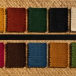
Camwood red-brown #7E4A32 · Raffia cream #E3D6B8 · Charcoal #2C2620 · Ochre #B08A3E · Deep bark #4B3A2A
Where the color comes from. The Kuba Kingdom of the Democratic Republic of Congo weaves cloth from raffia palm fiber, then embroiders and appliqués it into dense geometric patterns so admired that Matisse collected them. The colors are earth and forest: red-brown from tukula (camwood) paste, blacks and browns from mud and bark, cream from the undyed raffia itself. Each geometric block is improvised — the pattern deliberately breaks and restarts, a rhythm rather than a repeat.
What it means and how it feels. Kuba palettes are quiet earths in restless geometry: cream, ochre, camwood, charcoal. The impression is sophisticated and textural — the palette of a collector’s room, where the interest is in pattern and material rather than bright color. It layers beautifully over the Mali mudcloth family.
Hang it: the Earth Tone Abstract Africa Map or the two-piece Africa Map Set. Layer it: a Kuba-cloth-style geometric pillow cover.
A note on making color, respectfully
Notice the pattern across all twelve: almost none of these colors began as paint. Indigo is fermented, mudcloth is grown from a riverbed, otjize is pressed from ochre and fat, kente and Kuba pull their dyes from kola, camwood and bark, Ndebele walls once mixed clay with ash and dung. Color, on this continent, has almost always been agriculture and chemistry and patience — a thing you make from what the land gives you. When we bring these palettes home, the least we can do is know whose hands and which plants they came from, and name them. That is the difference between borrowing a look and honoring a source.
How to choose your palette
Start with temperature, not country. Rooms that face north or feel cold want the warm families — Morocco, Ghana, Mali, Kenya, Namibia (the terracotta-gold-ochre side). Rooms that overheat or need calm want the cool families — Senegal, Tanzania, Nigeria, Egypt (the indigo-turquoise side). Ethiopia and Congo sit in the middle, warm neutrals you can push either way. Then check what you already own: leather, rattan and warm woods pull toward Marrakech, Accra and the ochre palettes; linen, white walls and cooler woods pull toward Dakar, Zanzibar and lapis.
Whichever direction you choose, keep the 60-30-10 discipline. These palettes fail only one way: when every color is used at equal strength. African interiors — from riad courtyards to Swahili merchant houses to Ndebele homesteads — always let one family dominate and one color surprise.
The 10-minute version: hang the palette
The lowest-commitment way to test any of these schemes is printable art — the palette arrives on paper before you commit a single wall to paint. Print at home or at a local shop (our printing guide covers sizes and paper), frame in oak or black, and live with it for two weeks. For frames, a simple set of 11×14 oak-finish frames does the job. Want to preview your wall before you print? Drop your art into a room mock-up from Vecteezy’s mockup library, or build a full mood board with textures and papers from Creative Fabrica.
See these palettes on real artwork
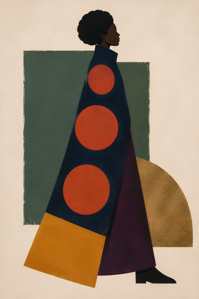
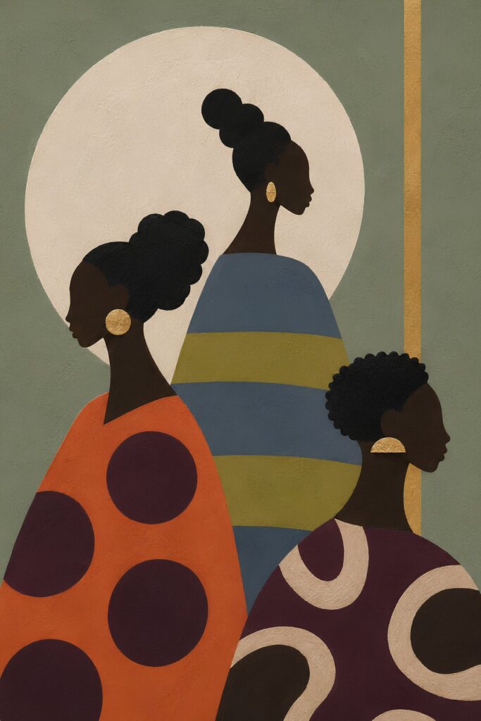
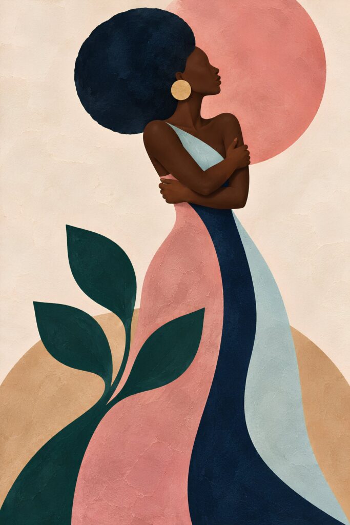
Terracotta, sage, mustard, blush and indigo run all through our own collection. These three pieces carry the palettes in this guide onto a wall.
Frequently asked questions
What colors are in a traditional African color palette?
There is no single answer — the continent holds 54 countries and hundreds of textile and pigment traditions. The families most used in interiors are earth tones (terracotta, ochre, clay, sand) from North, West and Southern African architecture and body art; gold-red-green-black from Ghanaian kente; indigo blues from West African dye traditions; turquoise-and-spice from the Swahili coast; the bright primaries of Ndebele wall painting; and the charcoal-and-bone of Malian mudcloth.
Where do African colors traditionally come from?
From the land, almost always. Indigo blue is fermented from indigo-plant leaves; Malian mudcloth black is grown from iron-rich river mud reacting with leaf tannins; Maasai and Himba red is iron-oxide ochre mixed with fat; kente and Kuba dyes come from kola nut, camwood and bark; Ndebele walls historically used clay, ash and ochre. Many colors are also trade goods — coral into Benin, cloves and cinnamon into Zanzibar, lapis into Egypt.
How do I use an african color palette without repainting my walls?
Keep walls neutral (bone, warm white, sand) and bring the palette in three layers: a wall-art set carrying the full scheme, textiles (cushions, throws) in the two dominant colors, and one accent object in the surprise color. Our three-piece art sets are designed to be that first layer in a single step.
Which african color palette fits a small apartment?
The Senegal indigo and Nigeria adire palettes are the most forgiving in small spaces — blue recedes, so rooms read larger, and the sand-and-brown base keeps them warm. In a studio, run the indigo family through art and textiles and keep furniture pale.
What do the colors in kente cloth mean?
In Ghanaian kente, gold means royalty and spiritual purity, green means growth and renewal, red means struggle and sacrifice, blue means peace and harmony, and black means maturity, spiritual energy and connection to the ancestors. Color in kente is a written language, which is why a Ghana palette feels so deliberate.
Are these palettes accurate to the cultures they come from?
Each palette is referenced to real places, textiles and dye traditions, and we name the source in every case — indigo dye cloth, Malian bogolan, Maasai ochre, Himba otjize, Ndebele wall art, Egyptian faience. They are homages built from observation, not official color systems; where a color carries specific cultural meaning, we say so and link to a deeper guide.
What is the 2026 color trend for African-inspired interiors?
Pinterest’s 2026 direction is warm saturated color over beige minimalism: persimmon-orange, deep plum, jade and cool blue. All four map directly onto African palettes — persimmon to Sahel terracotta, cool blue to indigo, jade to oasis green — which is why Afrohemian decor is the platform’s top 2026 home trend.
Related reading
- Global Decor Trends 2026: A Pinterest Data Analysis
- Afro-Boho Color Palette 2026
- Earthroot: A Warm Sister Palette to Indigo
- Indigo Decor: A Quiet Luxury Guide
- 12 Moroccan Symbols & Their Meanings
These are the source palettes. If you want to see where 2026’s trend colours actually came from — persimmon, jade, plum noir — we trace five of them back to these same traditions.
Closing
Twelve countries, twelve palettes, one rule: color with a source is color with a story. Start with the family that matches your light and your life, hang it before you paint it, and let one color surprise you. If you want the single shortcut, the Africa Map Wall Art Set of 3 in Terracotta is the set we recommend most often to readers starting an African palette from zero — three frames, whole scheme, one continent.