
Indigo Decor: A Quiet Luxury Guide to Afrocentric Wall Art in Blue Tones
By Essence of the Road Art
This article contains affiliate links. If you buy through our links, we may earn a small commission at no extra cost to you. We only recommend pieces we’d style in our own homes.
The colour that says everything without raising its voice
There is a particular shade of blue — somewhere between deep ocean and twilight, with a softness that feels almost humble — that has been showing up everywhere in the homes we admire most.
Not navy. Not cobalt. Not the bright Mediterranean blue of a styled holiday photo.
Indigo.
The kind of indigo you find on a 19th-century Yoruba Adire textile, or a faded West African mudcloth, or a hand-dyed Tuareg headwrap that has lived through a desert summer. This blue does not announce itself — it quietly carries the room.
If you have been searching for a way to make your space feel cultural and intentional without it feeling busy, indigo might be the answer. If you have been collecting Afrocentric wall art but feel that the warm-terracotta and ochre direction is not quite *yours*, this is the conversation we want to have.
📌 Quick Answer
Indigo decor is a quiet-luxury approach to Afrocentric styling that uses deep blue tones — drawn from West African indigo-dyeing traditions — instead of (or alongside) the more familiar terracotta and ochre palette. It works because indigo is historically tied to ancestral textile craft (Adire, mudcloth, Tuareg blue). It reads as both calm and powerful in modern interiors. It pairs effortlessly with cream, warm wood, brass, and charcoal.
The cleanest entry point is one indigo Afrocentric portrait or one indigo abstract Africa map, anchored against a neutral wall — then let the room build slowly from there.
Table of Contents
Why indigo carries weight that other blues don’t
If you have ever stood in front of a real piece of West African Adire cloth — the resist-dyed indigo textile of the Yoruba women of Nigeria — you know what we mean. The colour seems to come from inside the fabric.
This is not poetic exaggeration. Traditional indigo dyeing is one of the most labour-intensive textile processes on earth. The leaves of the indigo plant must be fermented in clay vats for days, sometimes weeks. The cloth is dipped, then exposed to air to oxidise — that is when the green liquid turns blue, right before your eyes. It is dipped again. And again. A deep, true indigo can take twenty dips to develop.
This is why indigo, when you bring it into your home as Afrocentric wall art, feels different from a piece of generic blue decor. It carries a memory whether you know it or not.
The shade has shown up across cultures for the same reason — Japan’s aizome indigo, India’s Bagru block-print indigo, the Tuareg blue of the Sahara, the Adire of Yorubaland, the Kuba cloth of the Congo basin in its blue-hued variants. Indigo is one of the very few colours that humanity has made the same way, almost everywhere, for nearly 6,000 years.
When you put an indigo print on your wall, you are joining a conversation that has been going on for a long time. That is the quiet weight of it.
Indigo and quiet luxury — why these two belong together
The aesthetic the design world is currently calling “quiet luxury” has a precise definition that most articles dance around. So let us name it directly.
Quiet luxury is the rejection of decoration as performance. It is the refusal of any object that is trying to be impressive. It is the choice of one beautiful thing over six average ones. It is texture instead of pattern. Material instead of label. Restraint instead of statement.
And indigo is, in many ways, the colour of that whole philosophy.
Here is what indigo does in a modern interior that other “statement” colours cannot:
- It reads as deep without being heavy. The room does not get smaller when indigo is added — it gets quieter.
- It pairs with warm tones (cream, oat, wheat, brass, walnut) in a way that feels collected rather than colour-blocked.
- It carries gravitas without ornament. A single indigo piece on a cream wall says more than a gallery of busier prints.
- It survives the decade test. Indigo Afrocentric art will not look dated in five years. The same cannot be said of every trending palette.
If your interiors instinct is for soft, slow, layered, intentional spaces — and you have been collecting beige and cream and feeling like something is missing — what is missing might be one note of indigo. Just one. Placed with care.
The four directions of indigo Afrocentric art (and which one is yours)
Not all indigo Afrocentric art is the same, and choosing the right kind matters more than choosing the right colour. Here are the four directions we see most often, and what each brings to a room.
1. Indigo portraiture (the human anchor)
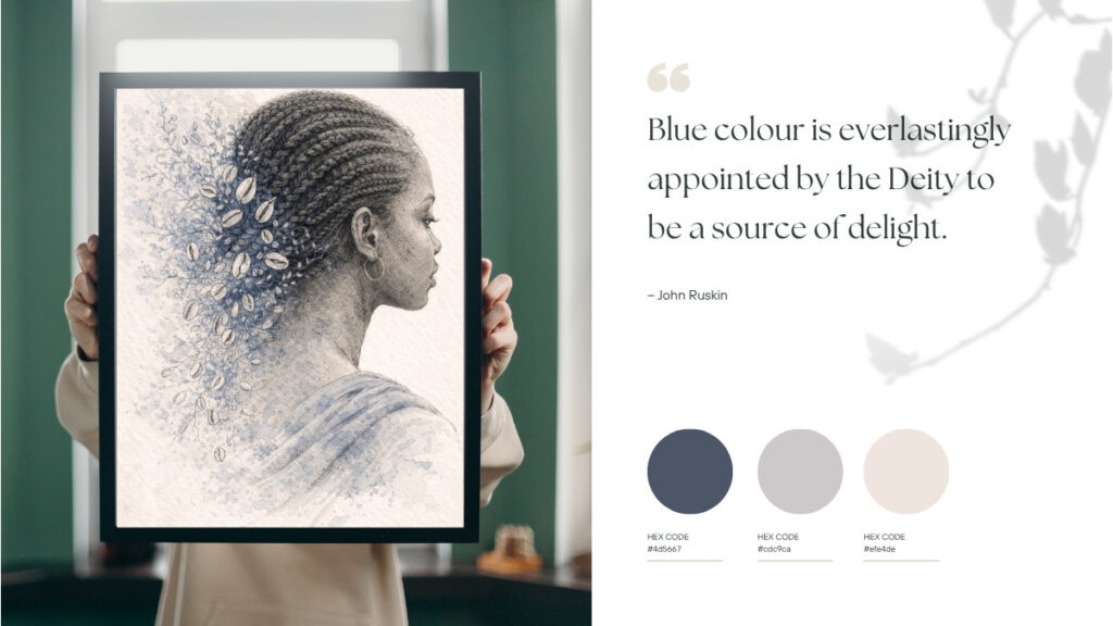
A Black woman in profile, rendered in soft ink lines and indigo wash, against a quiet background. The face is not the subject — presence is the subject. These pieces become the emotional anchor of a room. They invite the eye to rest. They work especially well over a sofa, beside a bed, or in a quiet corner where you read.
If your home tends to be calm and you want one piece that holds meaning without shouting, this is your direction.
2. Indigo abstract Africa (the cultural anchor)
A modern abstract interpretation of the African continent — a layered map shape rendered in indigo, sand, and charcoal, with linework that suggests movement and memory rather than geography. This is how you bring ancestral reference into a modern home without it tipping into folk-craft styling.
If you are building a space that honours heritage but lives in 2026, this is your direction. For a deeper read on this, our guide to African textiles and their meanings walks through the symbolism behind mudcloth, Kuba, Adire and Kente.)*
3. Indigo still life (the quiet ritual)
A vase, a cloth, a folded textile, a single bird. Soft, almost unfinished compositions in indigo and patina blue. These are the pieces that read like a held breath. They belong in bedrooms, meditation corners, small studios, the room you go into when the day has been too loud.
If your home is your sanctuary and you want art that feels like coming home, this is your direction.
4. Indigo gesture (the relational note)
Two figures, sometimes a mother and a child, sometimes two hands, sometimes a woman and a bird. Tenderness rendered in the smallest amount of line possible. These are family-room pieces. Not sentimental, not cute — just true.
If you want a piece that feels like love but does not say the word, this is your direction.
For every cool indigo note in a room, add two warm notes.
This is the question we get asked most often, and the answer is simpler than you would expect.
The mistake people make is treating indigo like navy — pairing it with grey, white, and chrome. That combination can work, but it almost always reads cold. Indigo’s natural partner is warmth, not contrast.
The warm notes can be wood, cream linen, oat-coloured wool, terracotta clay, brass, dried grasses, leather. Warm light from a low lamp counts. A jute rug counts.
A practical example: an indigo Afrocentric portrait on a cream wall, framed in walnut, sitting above a low oak console with one terracotta vessel and a single dried branch. The room reads warm and grounded — but the indigo is still doing its quiet work in the centre.
Three more guidelines we follow:
- Indigo loves negative space. Resist the urge to surround it with more art. One indigo piece, given room to breathe, says more than three indigo pieces grouped together.
- Indigo wants matte. Avoid glass-front frames where you can; matte paper or canvas finishes hold the depth of the colour better. If you do frame behind glass, choose museum or anti-reflective.
- Repeat the indigo somewhere small. A single indigo cushion. A small indigo dish on a shelf. The art piece does the heavy lifting; the small repeat tells the eye it was intentional.
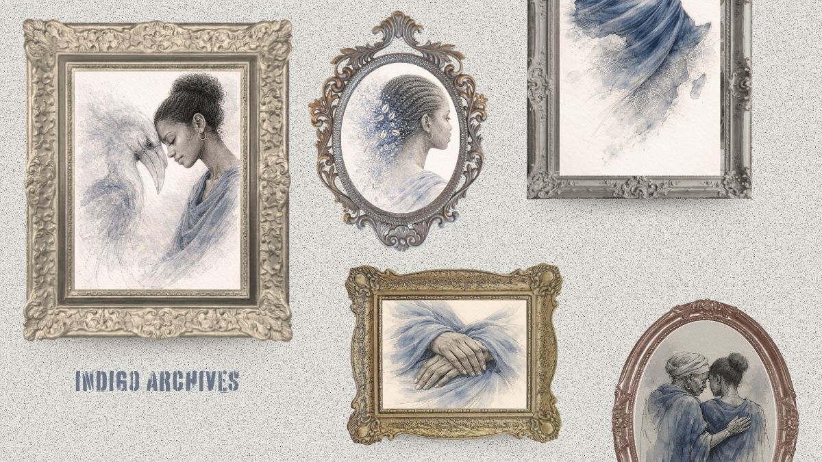
How the Indigo Archives came to be
This is the part of the article we wrestled with most, because the honest version is more interesting than the romantic one.
The Indigo Archives did not begin with us standing in a museum being moved by a piece of Adire cloth. It began with a much more practical question: What is missing from Afrocentric wall art right now, and is there room for something genuinely different?
We sat down to study what already existed. The market, we found, was crowded in a few specific directions — bold Afro-futurism, neon-saturated digital art, gold-and-Kente-pattern abundance, hyper-stylized portraits in maximalist palettes. All beautiful in their own way, all already being made by other artists, often better than we could match.
What was missing was the opposite: Softness. Tenderness. Restraint. Afrocentric art that did not announce itself the moment you entered the room. Art that whispered rather than shouted, while still carrying full cultural weight.
That gap had a name we kept coming back to: quiet luxury. The same philosophy that has reshaped fashion and interiors over the past decade had not yet been carried into the Afrocentric editorial space. There were no series — that we could find — using indigo as the dominant palette, ink-and-watercolour as the technique, and ancestral symbolism as the cultural anchor, all at once. So we made one.
The aesthetic principles were chosen deliberately, not stumbled into:
- Indigo as the foundation — because it is one of the few Afrocentric palette anchors with deep textile history (Adire, Tuareg blue, mudcloth indigo) that has not been visually exhausted in modern decor
- Hand-drawn ink and watercolour textures — to push back against the hyper-polished digital realism flooding Etsy and Pinterest.
- Symbolic, not literal, imagery — woman and hornbill (lineage), cowrie and braid (memory), clay vessel and water (continuity) — each chosen for what it means, not for visual effect.
- Editorial restraint over decorative abundance — one piece given room to breathe, the way museum work is hung, rather than crowded gallery-wall density.
- Bone-white and ash as the breathing space — neutrals chosen so the indigo could carry full depth without competing
That gave us a brief. From the brief came a 12-image editorial sequence — opening, intimacy, symbolism, ritual, closure — and from the sequence emerged the six volumes you see today.
We did not plan all six in advance. The 12 images came first; the volumes revealed themselves as we worked through them, finding which images belonged together as triptychs, which themes deserved their own chapter.
What we share this for is a small thing, but an important one: when you bring a piece from this series into your home, you are not buying a print that was generated and listed. You are bringing in something that came out of a deliberate study of what was missing from a saturated visual field — and a careful answer to it.
That is what we mean by Quiet Afrocentric Luxury. Not the appearance of restraint, but the practice of it. A category that did not exist as a defined space before this collection — and that we hope will keep growing, with our work and others’, into a genuine new direction in Afrocentric editorial art.
The Indigo Archives — six volumes, one quiet language
The series itself is printable, digital download, sized for gallery walls. Each volume is a curated set of three coordinated pieces that can live together or be split across rooms.
Volume 1 — Ancestral Beauty is the portrait volume. A Black woman, an indigo bird, and a spiritual illustration in the same restrained palette. This is where we recommend most people start.
Volume 2 — Abstract Africa carries the continent into modern abstraction. An indigo Africa map, a portrait, and a man’s silhouette — three pieces that hold cultural weight without being literal.
Volume 3 — Hair as Archive is for those who understand that Black hair is its own form of storytelling. Three studies in indigo and patina blue, each one a small monument.
Volume 4 — Ancestral Touch introduces the ancestral memory series — woman and bird in symbolic communion, the figure of guidance that shows up in many West African spiritual traditions.
Volume 5 — Quiet Love is the family volume. *”Where love is quiet, it endures.”* Tender gestures rendered in the softest indigo washes — for bedrooms, family rooms, the spaces where the day finally slows down.
Volume 6 — The Quiet Ritual is the still-life closing chapter. Vessels, folds, a single object given the dignity of being looked at. These work beautifully in bathrooms, breakfast nooks, and writing desks.
For repeat collectors of the series, the code ARCHIVE15 is a small thank-you we offer.
If you are starting from scratch, we would build outward from one volume at a time — most of our customers begin with Volume 1 or Volume 2 and add the others as the room grows.
Supporting accents that let the indigo breathe
This is the section where most decor blogs hand you a long list of links. We will keep ours short, because the whole point of indigo Afrocentric styling is less, but better. What you actually need around your indigo art is a small collection of warm, textural, honest pieces — frames, neutral textiles, a vessel or two, lighting that is soft. That is it.
| Piece | What it does in an indigo room | Approx. price |
|---|---|---|
| Solid wood gallery frames in walnut or natural oak | The right frame is what turns a print into an heirloom. Avoid black plastic — it competes with the indigo | ~$25–60 |
| Cream linen or wool throw | Adds the warm note that keeps indigo from reading cold | ~$30–50 |
| Handmade terracotta vessel | One unglazed clay piece on a console reactivates the warmth-to-cool ratio | ~$25–45 |
| Brass or aged-bronze table lamp | Indigo loves warm metallics; cool chrome flattens it | ~$60–120 |
| Jute or sisal area rug | Grounds the room in something organic — the floor texture matters | ~$80–180 |
A note on framing: if your budget is tight, thrift-store wood frames in walnut or oak tones often look more intentional than new black plastic ones. Refinish lightly if needed. Indigo art is forgiving — it is the frame that often makes or breaks the styling.
A bedroom you can build this season for under $260
o make everything we have just talked about concrete — the indigo, the warmth ratio, the negative space, the framing — here is one full indigo Afrocentric bedroom you could build over a single weekend, at a real-world price point.
We have priced it for the version of yourself who does not want to compromise on the feel, but also does not want to spend $1,500 to get the room right. This is the entry point to quiet luxury. The rest, you build into it as the years go on.
| The piece | What it does | What we recommend | Approx. cost |
|---|---|---|---|
| The anchor | Sets the indigo tone for the whole room | Indigo Archives Volume 1 — Ancestral Beauty — three coordinated portrait prints, instant digital download | $30 (files) + $40 (printing) |
| The frames | Turn prints into heirlooms; warm wood pulls indigo into harmony | Three matching walnut wood gallery frames (avoid black plastic) | $75 ($25 × 3) |
| The cream layer | Adds the warm note that keeps indigo from reading cold | One cream linen throw folded across the foot of the bed | $40 |
| The terracotta note | Reactivates the warmth-to-cool ratio at eye level | One small handmade terracotta vessel on the nightstand with a single dried branch | $25 |
| The light | Indigo loves warm metallics; cool chrome flattens it | One small brass or aged-bronze table lamp with a warm 2700K bulb | $45 |
| Total | ~$255 |
A note on the printing: digital download means you can print at any size, on any paper, at any local print shop. Most of our customers print on matte fine art paper (cotton rag if budget allows) at sizes between 8×10 and 11×14 inches. A neighbourhood print shop usually charges $10–15 per print at that size; FedEx Office, Staples, and Walgreens online all run regular promotions. If you have a decent inkjet at home and good matte photo paper, you can do it yourself for under $10 total.
How the room comes together
The build sequence matters as much as the budget. We would do it in this order, on a slow Sunday:
- Print and frame the three pieces first — let them sit out somewhere visible for a day before you commit to where they hang. The eye needs time to learn an indigo it has not lived with before.
- Hang the gallery wall above whatever surface anchors your bedroom — usually the bed itself, but also lovely above a dresser or a low bench. Three frames in a horizontal row, evenly spaced, eye-level for the centre frame.
- Lay the cream throw across the foot of the bed, folded once lengthwise. Not arranged. Folded the way it would be in a hotel room you stayed in once and never forgot.
- Place the terracotta vessel on the nightstand on the side you do not sleep on (so it does not get knocked over in the morning). One dried branch in it. Not three.
- Plug in the lamp last and turn it on at dusk. This is the moment the room becomes itself.
That is the whole build. Five pieces. Around $255. One quiet, intentional bedroom that will still feel right in 2031.
If you want to spend less, skip the lamp and use a candle on the nightstand for a season — about $50 saved, and the room still works. If you want to spend more, the place to upgrade first is the framing: linen-mat museum-quality framing at $80 a piece elevates the whole room another level.
The result, however you build it: a bedroom with a real indigo Afrocentric gallery wall — three pieces, properly framed, sitting against a cream-toned wall, anchored by warm wood and brass, softened by linen, grounded by one small clay vessel. Everything in the room has a job. Nothing is fighting for attention.
In three years it will still look right. That is the promise of quiet luxury, and it is the whole reason indigo works.
FAQ
Is indigo decor a trend or a timeless palette?
Indigo is one of the few palettes that consistently survives every design cycle, because it is rooted in textile and craft history rather than fashion. It has been a foundational interior colour across West Africa, Japan, India, and the American South for centuries. Trends move; indigo stays. If you build a room around it now, that room will read as intentional in five years and ten years.
How do I mix indigo Afrocentric art with my existing terracotta and ochre decor?
Indigo and terracotta are old friends — they show up together on traditional West African textiles for a reason. The trick is ratio. If your room is currently 70% terracotta and ochre, introduce indigo as roughly 15–20% (one or two pieces of art, plus a small repeat) and leave the rest alone. The indigo will deepen the terracotta rather than fight it. If you want the indigo to dominate, flip the ratio: indigo as the anchor, terracotta and ochre as the warm accents.
Where in the home does indigo Afrocentric wall art look best?
Bedrooms first, because indigo’s quiet-restorative quality shines most in the room where you slow down. Reading nooks and offices second, because indigo supports focus rather than scattering attention. Living rooms third — beautifully — but living rooms with indigo need an extra warm layer (a wool throw, a wood coffee table, a soft jute rug) to keep the space feeling welcoming. Bathrooms can be wonderful for small indigo still-life prints; the moisture and tile already create a calm, ritual atmosphere that indigo amplifies.
What’s the difference between indigo decor and Japandi or coastal blue?
Japandi blue is colder and tends to lean toward grey-blue and slate. Coastal blue is brighter, more saturated, and often paired with white. Indigo Afrocentric art occupies a different register entirely — it is warmer than Japandi (because it is paired with cream and clay rather than grey and oak), more grounded than coastal (because it carries cultural and craft references), and almost always softer in tone. The closest cousin in feeling is Mediterranean indigo or Moroccan deep blue, both of which share the same earth-dye ancestry.
A closing thought on the colour of memory
There is a reason indigo keeps coming back. It is not because designers decided it should — it is because indigo is, in some quiet way, the colour of carrying things.
It carries the work of the women who fermented the dye. It carries the journey of the cloth across markets and continents. It carries the patience of the deep dipping process, the layered hands that made it possible. When you put an indigo Afrocentric portrait on your wall, you are not just decorating — you are joining that lineage of carrying.
That is what we mean by quiet luxury. Not money, not exclusivity, not the trappings. Just: a beautiful object that knows where it came from, in a room that has the grace to listen.
The kind of room where, on a slow Sunday morning, you walk past the indigo print on the wall and it does not interrupt you. It just *holds* the morning, the way it has held mornings for 6,000 years.
That is the room we are trying to make room for.
We would add: especially when it has been carried that far, and dipped that many times, by hands that knew what they were doing.
Also read:
How to Mix Global Motifs at Home Without Losing Yourself
How to Style Afrocentric Wall Art for a Modern Home
A Respectful Guide to African Textiles and What They Mean
Afrocentric Bedroom Ideas for a Calm, Soulful Sanctuary
Shop the Indigo Archives Collection on Etsy