Moroccan Color Palette: 5 Souk-Inspired Schemes for a Soulful Home
By Essence of the Road Art · Published July 2026
This article contains affiliate links. If you buy through them, we may earn a small commission at no extra cost to you. We only feature pieces we would live with ourselves.
Morocco does not decorate with color — it builds with it. The walls of Marrakech are pigmented earth; the blue of Chefchaouen is lime wash renewed by hand each spring; the gold in the spice souk is literally saffron. That is why a moroccan color palette feels different from a color trend: every shade has an address.
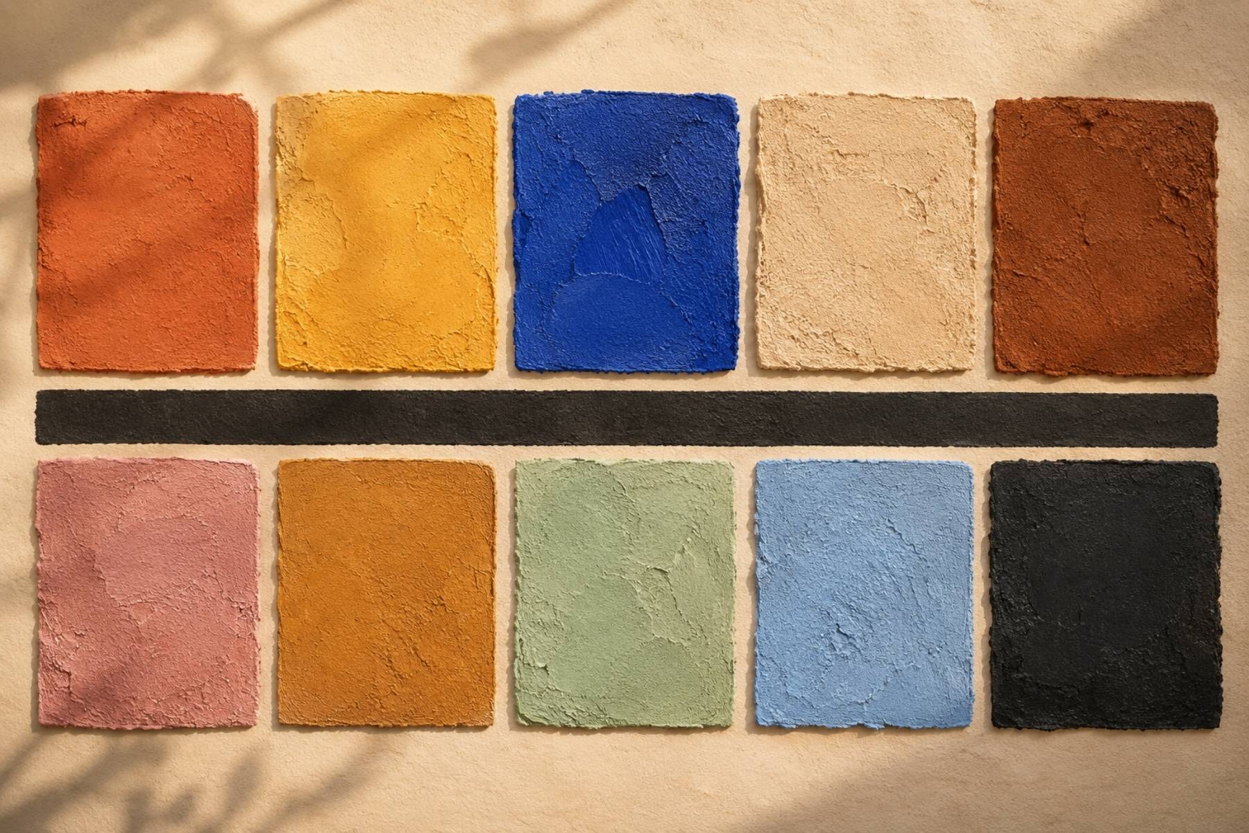
This guide breaks Morocco into five livable schemes, each with hex codes, its real-world source, and the room it serves best. It pairs with our 12 Moroccan symbols guide — that article gives the motifs, this one gives them their colors.
Quick answer: The classic moroccan color palette layers warm mineral neutrals — terracotta, sand, clay — with one saturated jewel accent: Majorelle blue, saffron or emerald. Use earth tones for roughly 60% of the room, one mid-strength color for 30%, and the jewel for the final 10%. Our Neutral Terracotta Botanical trio carries the core scheme in a single three-frame set.
Table of Contents
1. The Marrakech Souk — the signature scheme
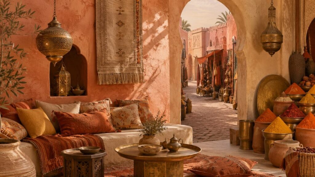
Terracotta #C1683C · Saffron #E0A526 · Warm sand #E8D5B5 · Charred clay #6E3B23 · Brass #B08D4A
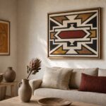
This is the palette people mean when they say “Moroccan”: the pink-orange of the medina’s pisé walls, spice pyramids, hammered brass lanterns. It is warm-on-warm layering — no true white, no cold gray anywhere. In a living room, put terracotta in the largest soft pieces, keep walls sand, and let brass carry the light.
Wall art in this scheme wants texture over gloss. Our Earth Tone Terracotta & Africa Map trio was composed in exactly these tones — collage texture included.
2. Majorelle — the one-blue rule
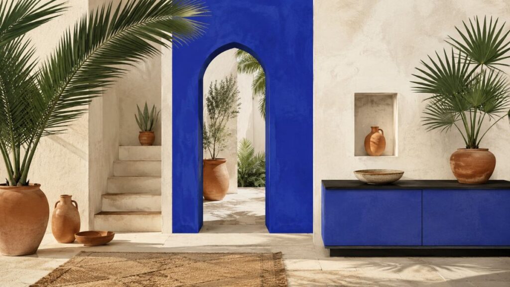
Majorelle cobalt #4B5CC4 · Terracotta #C1683C · Palm green #3F6B4F · Bone #F0E8D8 · Ink #22242E
Jacques Majorelle patented a blue so intense the garden wearing it became a pilgrimage. The lesson of that garden is restraint: one saturated cobalt against warm neutrals and green, never blue-on-blue-on-blue. At home this means a single Majorelle element — one wall, one cabinet, or one framed print — while everything around it stays mineral and warm.
For the art route, blue-forward pieces from our Indigo collection do the Majorelle job with West African depth — the Indigo Black Woman & Bird trio is the set we reach for first.
3. Fes Medina — the leather and honey scheme
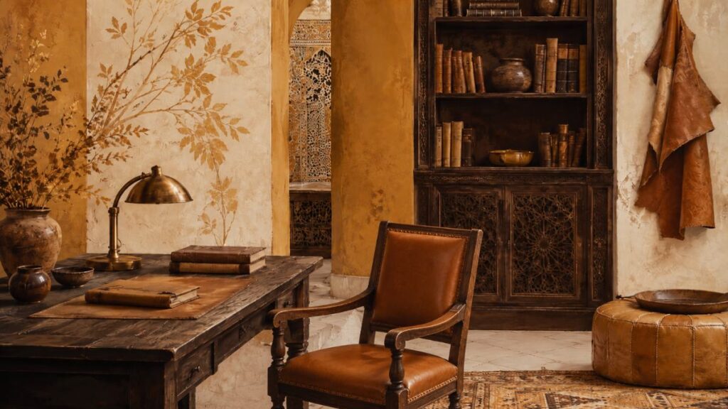
Tannery ochre #C28E3C · Saddle brown #7A4A28 · Honey #D9B26A · Plaster white #EDE4D3 · Cedar dark #3E2E22
Fes is Morocco’s brown family: the famous tanneries, honey-colored leather, carved cedar ceilings. It is the most masculine and the most forgiving of the five schemes — it flatters existing wood furniture instead of fighting it. Use it in offices, dens and dining rooms where leather and books already live.
Style note: this scheme loves aged finishes. Frames in walnut or dark oak, never chrome. A set of walnut-finish frames plus botanical prints in ochre tones — our Afro Boho Neutral Botanical trio sits perfectly here — completes it.
4. Atlas & Sahara — the quiet desert neutrals
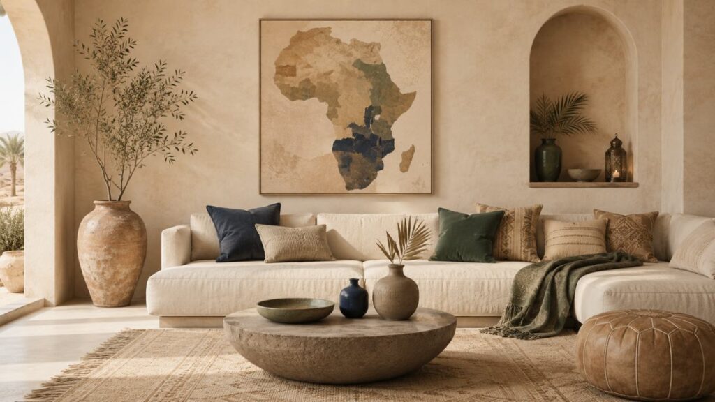
Dune #DCC7A5 · Pale clay #C9A47E · Stone gray-brown #8F7B66 · Oasis green #5E7A5A · Night indigo #33415C
The desert scheme is Morocco with the saturation turned down — the palette for people who love the Marrakech feeling but live in a small or low-light space. Sand-family neutrals do the work; oasis green and night indigo appear only in objects and art. This is the closest Moroccan cousin to the “quiet luxury” direction we mapped in Earthroot.
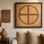
Because the base is so quiet, the art can carry the whole palette: one abstract Africa map in earth tones above a sofa gives the room its entire color argument in a single frame.
5. Chefchaouen — the washed blue exception
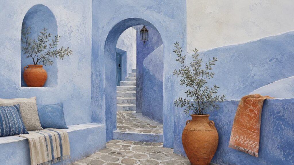
Powder blue #8FB3D1 · Periwinkle #6E85B7 · White wash #F2F0E9 · Cobblestone #9B958A · Terracotta accent #C1683C
Chefchaouen breaks every other Moroccan rule: it is cool, pale and blue on blue on blue. The town repaints itself by hand in lime washes, which is why the blues look chalky rather than glossy — replicate that with matte finishes only. It is the scheme for bathrooms, bedrooms and anywhere you want Morocco to whisper.
Keep one warm counterweight — the terracotta accent above — or the room tips cold. A single warm-toned print, like one piece from the Terracotta Africa Map, is enough.
How to choose between the five
Follow the light. South-facing and warm rooms can afford Chefchaouen and Atlas restraint; north-facing and dark rooms need Marrakech or Fes warmth; Majorelle works anywhere because its base is neutral. Then follow the function: souk energy for living and dining, Fes for work, desert and Chefchaouen for rest.
If you want the palette without commitment, print it first. All our sets are digital downloads with every standard ratio included — print at home, test the scheme for two weeks, then paint only if the room still asks for it. For print-quality mockups and extra Moroccan pattern resources, Creative Fabrica and Vecteezy are the two libraries we use in our own workflow.
Frequently asked questions
What are the traditional colors of Morocco?
Mineral earth colors form the base — terracotta, clay, sand, ochre — because traditional building materials were pigmented earth and lime. Onto that base go the famous saturated accents: Majorelle cobalt, saffron yellow, mint green and the rose pink of Marrakech’s walls. Black and brass function as the finishing metals.
What is Majorelle blue exactly?
Majorelle blue is the intense ultramarine-cobalt Jacques Majorelle used throughout his Marrakech garden in the 1920s and 30s — close to #4B5CC4 on screen. It works in interiors as a single-statement color against warm neutrals, echoing how the garden sets it against terracotta pots and green palms.
How do I make a moroccan color palette work in a rental?
Skip paint entirely. Sand-colored walls are the default in most rentals already; add the palette through a three-piece art set, two textile layers (cushions, a throw) and one brass or clay object. Everything packs into a moving box — see our rental styling guide for the full method.
Does the moroccan color palette work with modern furniture?
Better than with imitation-riad furniture, honestly. Clean-lined sofas and pale woods give the mineral colors room to breathe — the palette supplies the atmosphere, the furniture supplies the restraint. The combination is exactly what the Afrohemian trend on Pinterest looks like in practice.
Which colors should I avoid mixing with it?
Cold blue-grays and stark optic white fight the mineral base — they make terracotta look orange and sand look dirty. If you need pale tones, use bone, plaster and cream; if you need dark ones, use ink, cedar and charred clay rather than pure black or slate.
Related reading
- African Color Palette Guide 2026: From Marrakech to Zanzibar
- 12 Moroccan Symbols & Their Meanings: A Decor Lover’s Guide
- Earthroot: A Warm Sister Palette to Indigo
- Indigo Decor: A Quiet Luxury Guide
- Afro-Boho Color Palette 2026
If none of the five feels like yours, the warmth may be West African rather than North African — the Ghana palette runs gold and cocoa where Morocco runs clay and cobalt.
Closing
Five schemes, one grammar: warm mineral base, one deliberate jewel, matte over gloss. Start with the scheme your light allows, hang it before you paint it, and let Marrakech teach you the one-blue rule. The set we recommend as the first move is the Neutral Terracotta Botanical trio — it carries the souk palette into any room in three frames.
Marrakech clay is also having a moment under a different name. Persimmon, 2026’s headline colour, is the same tone the souk has used for centuries.