2026 Color Trends With African Roots: 5 Colors, 5 Real Sources
By Essence of the Road Art · Published July 2026
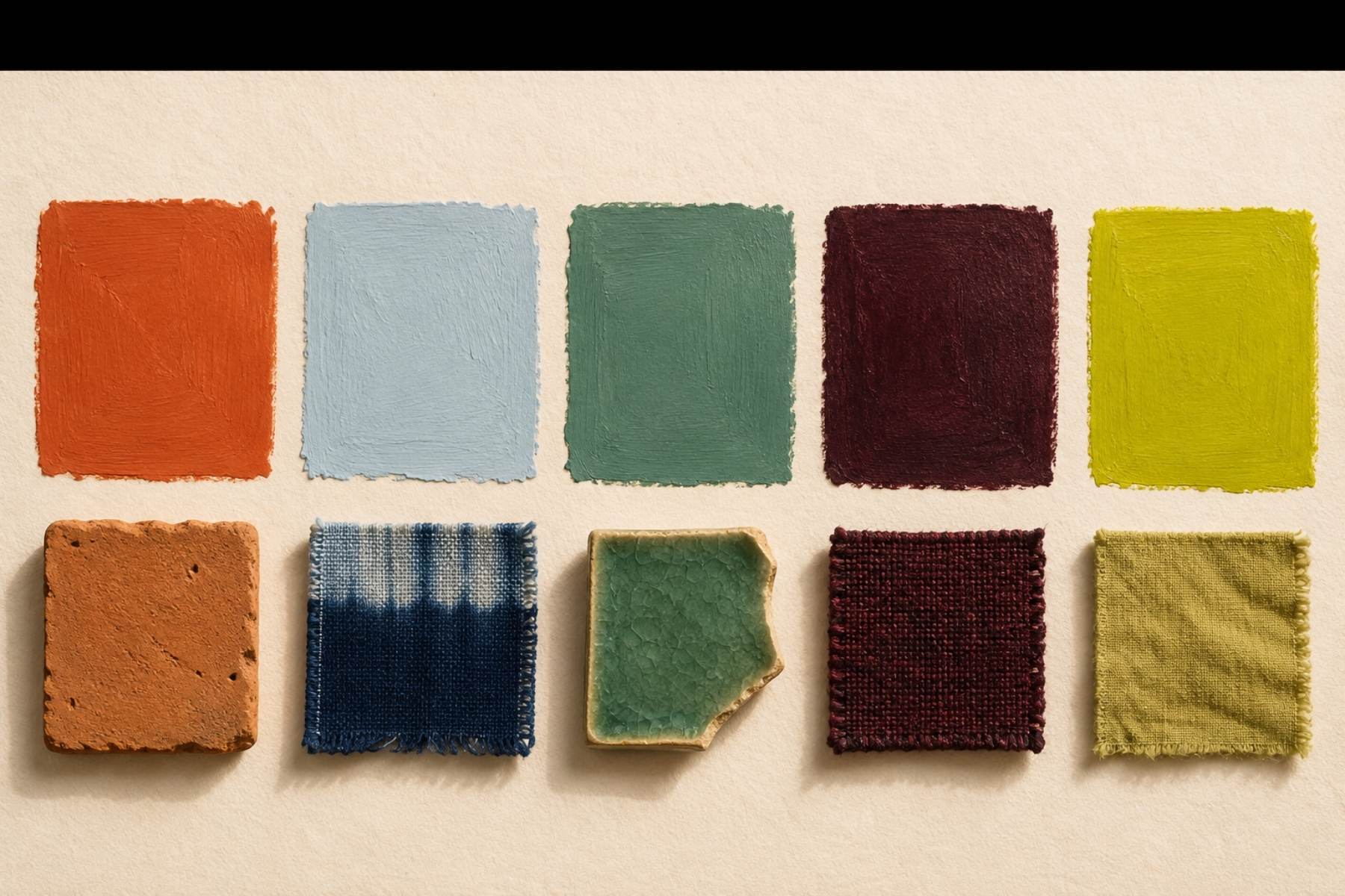
By midsummer, every trend list for the year says the same five things: a warm orange-red, a pale glacial blue, a mint-moss green, a burgundy-brown dark and one strange electric chartreuse. Persimmon, cool blue, jade, plum noir, wasabi. You have seen the names; half the internet has already repeated them.
So this is not another announcement. This is the article the announcements skip. Because here is what almost nobody writing about the 2026 color trends will tell you: none of these colors is new, and every one of them has an African address older than the paint industry. Persimmon is the rammed-earth wall of Marrakech and the ochre the Himba press into their skin. Cool blue came out of a West African indigo vat — it is dip number one of a nine-century-old recipe. Plum noir is what camwood paste has always done to Kuba cloth. And wasabi, the list’s oddball, is hiding the best secret of all: it is the color every Malian mudcloth starts as, before the mud ever touches the cotton.
Knowing the source changes how you buy the color. Trend names expire every December; clay, indigo, camwood and leaf-dye never have. So for each of the five shades below you get the pair other guides don’t give you — the trend hex and the source hex — plus the craft it comes from, what the color means where it was made, and a 60-30-10 room recipe that will still make sense in 2030.
Quick answer: The five defining 2026 color trends — persimmon, cool blue, jade, plum noir and wasabi — all map onto African craft colors: Sahel terracotta, first-dip indigo, oasis green, camwood plum and n’gallama leaf-dye chartreuse. Buy each shade at its source rather than by its trend name and the room outlives the forecast. The two-piece starter is our Africa Map Wall Art Set of 3 in Terracotta for the warm side and the Indigo Africa Map poster for the cool.
Table of Contents
Why the 2026 color trends all point the same direction
Strip away the marketing names and the five shades tell one story: the beige era is closing, and what replaces it is saturated, warm-blooded color that looks handmade rather than manufactured. Deep plum tones are the fastest risers of the year; pale blues and mossy greens are climbing behind them; and warm clay-orange has quietly become the default “new neutral” of design imagery.
That direction has a name on this blog: it is the Afrohemian movement seen through a color filter. People are saving rooms that feel layered, specific and made by hands — and rooms like that, statistically, are full of terracotta, indigo, green and deep plum textiles. The 2026 color trends are not five random shades; they are the color layer of that bigger appetite. Which is exactly why going to the African sources is not a detour — it is the shortcut.
1. Persimmon → Sahel terracotta
Trend shade #D96B43 · Source shade #C1683C · Burnt clay #9C4A2E · Warm sand #E8D5B5 · Char #3A2A20
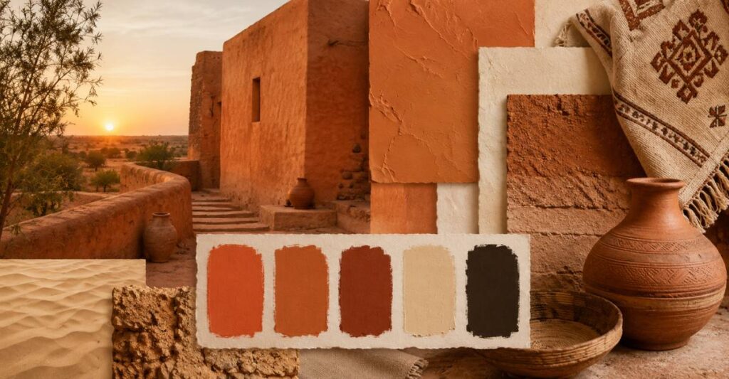
The source. This color is a building material before it is a mood. Marrakech is rendered in iron-rich rammed earth that glows exactly this shade at sunset; the Great Mosque of Djenné is sculpted from it; northern Ghana paints it onto compound walls; the Himba of Namibia wear it daily as otjize, red ochre worked into butterfat. Persimmon is the earth itself, fired by sun — the most literal color on the 2026 list.
What it means at the source. Across the Sahel and Southern Africa, red-orange earth is the color of home, protection and beauty — Himba women describe otjize as their signature look, and mud-built towns re-plaster their walls together after every rainy season, a communal act of renewal.
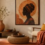
The room recipe. The safest full-strength shade of the five: walls, sofas and large art all take it. Recipe: warm sand base at 60, persimmon lead at 30, char accents at 10. Buy the source: the Africa Map Terracotta Set of 3 or the Terracotta Silhouette print, layered with terracotta and rust pillow covers. Full schemes live in our Moroccan palette guide and Earthroot.
2. Cool blue → first-dip indigo
Trend shade #7FA9C9 · Source shade #5C7599 · Deep indigo #2B3A67 · Glacier white #F1F2EE · Ink #1D2438
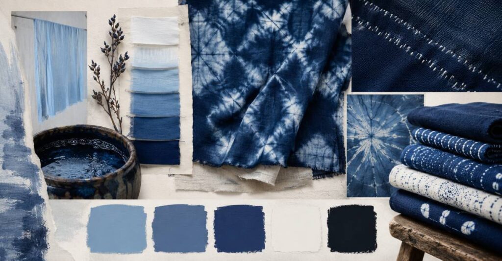
The source. Indigo cloth is not painted blue; it is built blue. The dyer ferments indigo leaves in a vat, dips the cotton, airs it, dips again — and the first dip produces exactly the pale, airy blue the trend lists have just fallen for. Senegalese, Guinean and Yoruba dyers have worked this whole gradient deliberately for close to a millennium, which makes cool blue the least new “new color” of the decade. The vat’s best trick: cloth comes out yellow-green and turns blue before your eyes as it oxidizes in the air.
What it means at the source. Across the indigo belt, deep blue has been the cloth of dignity — woven into weddings, worn for protection, traded like currency. The pale end is simply the same story at chapter one.
The room recipe. Run the gradient, not the single shade: pale blue walls or bedding, denim mid-tones in textiles, one object in true indigo. Buy the source: the Indigo Africa Map poster or the 18-piece Indigo bundle, layered with an indigo shibori-style throw. The full vat-to-bedroom story is in our Senegal color palette guide.
3. Jade → oasis green and faience
Trend shade #6FA287 · Source shade #5E7A5A · Faience #3FA4A0 · Palm deep #3F6B4F · Bone #EFE6D4
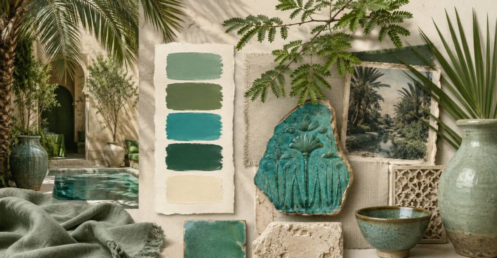
The source. Jade’s mint-moss temperature has three old African homes. The palm-and-mint greens of Marrakech courtyards, where green is literally the luxury of shade and water. The acacia and new-leaf greens of the East African highlands. And the oldest: Egyptian faience, the self-glazing ceramic that fired to this exact green-turquoise five thousand years ago and was shaped into amulets worn for rebirth and protection.
What it means at the source. In an oasis economy, green is wealth you can drink — calm with status attached. Faience carried the same idea into eternity: the color of coming back to life.
The room recipe. Jade behaves best in matte, organic finishes: plants, glazed ceramics, linen, plus one artwork holding its blue-green midpoint. Bone base at 60, jade lead at 30, palm-deep accents at 10. Buy the source: the Beige & Teal Abstract Africa Map sits precisely on jade’s midpoint, and the Black Woman & Botanical Set of 3 supplies the leaf tones — layer with a jade green ceramic vase.
4. Plum noir → camwood and overdyed indigo
Trend shade #4A2E3F · Source shade #7E4A32 · Burnt burgundy #6E3044 · Aubergine ink #332338 · Shell cream #EFE7DA
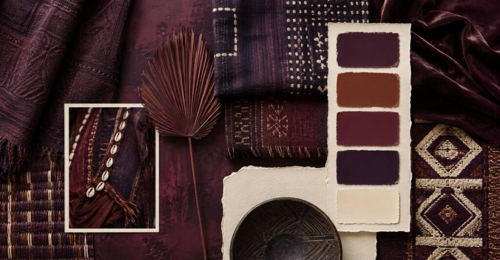
The source. Deep red-browns shading into black are a signature of Central and West African cloth. Kuba weavers in the DR Congo rub raffia textiles with tukula — camwood paste — for exactly this warm, red-brown depth; the cloths were treasured enough that Matisse pinned them to his studio walls. Ethiopian church painters robe their saints in crimson darkened toward plum. And across the indigo belt, dyers overdye red or brown cloth with indigo to reach shades the eye reads as plum-black.
What it means at the source. This is the continent’s formal-wear register: depth as dignity, the color of ceremony and standing rather than gloom.
The room recipe. For most homes plum noir is an accent-and-below color: a velvet chair, curtains, the darkest artwork on the wall. Never the biggest surface first. Buy the source: the Vintage Africa Map, dark painterly was composed in this register, and the Afrofuturist Black Woman celestial print pairs plum with blue and gold — layer with a plum velvet cushion set.
5. Wasabi → the leaf bath under every mudcloth
Trend shade #AEBD5A · Source shade #C8B24A · Chartreuse #C4CE4A · Olive keeper #7D8148 · Warm white #F4F0E5
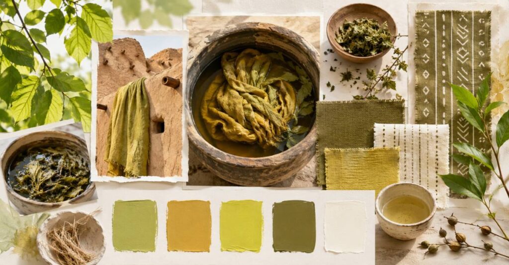
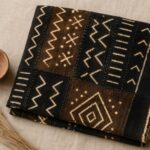
The source. Here is this article’s best secret. Before any mud touches Malian bògòlanfini, the cotton is bathed in pounded n’gallama leaves, which stain it a bright yellow-green — the exact chartreuse family the trend world has just discovered and named after sushi condiment. Every mudcloth maker has seen this color on every cloth they have ever begun; the finished textile simply keeps it hidden under the pattern, where the leaf tannin waits to react with the iron in the mud. Senegal’s attaya tea holds the same green-gold light in a glass, three rounds at a time.
What it means at the source. Wasabi’s African root is the color of beginning — the prepared cloth, the brewed first round, the stage before the visible work. There are worse things for a home office to be painted in.
The room recipe. Seasoning, never the meal: one throw, one vase, fresh stems, one print with green-gold notes. Warm white base at 60, olive mid-tones at 30, chartreuse at 10 — and only in rooms with real daylight. Buy the source: the Colorful Afrocentric Africa Map poster carries the bright note, the Neutral Botanical trio holds the quiet end — layer with a chartreuse woven throw.
The translation table: trend name → durable buy
The practical difference between following the 2026 color trends and owning them is what you type into a search box. Instead of the trend name, buy the craft: for persimmon, search terracotta pots, clay-toned art and rust linen. For cool blue, indigo and shibori textiles. For jade, glazed ceramics and botanical prints. For plum noir, camwood-toned and burgundy velvet. For wasabi, olive and chartreuse weaves. Every one of those searches returns objects that existed before the trend cycle and will outlast it — and most of them cost less than the items launched under the 2026 names.
The same logic runs our own shop: nothing in the collection was designed “for 2026,” yet the terracotta sets, indigo bundles and dark painterly maps cover four of the five shades — because the shades were always African staples. That is the quiet advantage of sourcing color from craft traditions instead of forecasts.
One room, all five — without the carnival
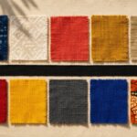
The five shades assemble into the 60-30-10 rhythm we use in every guide. Base: warm neutrals from persimmon’s quiet end — sand, bone, shell cream — at 60 percent. Lead: your temperature choice — persimmon for cold rooms, cool blue or jade for bright ones — at 30. Accent: plum noir for depth or wasabi for wit at the final 10. The single mistake that breaks it is democracy: five colors at equal volume is a carnival, not a palette.
Room by room: living rooms take persimmon lead with plum depth; bedrooms take cool blue lead with jade support; kitchens and studios are where wasabi earns its keep; and a study in plum noir with one persimmon object is the most current room it is possible to own — in any year.
Will these colors date?
Less than any trend list in recent memory, and now you know why: each shade is pinned to a pigment or dye with centuries of continuous use. Terracotta rooms did not date between the founding of Djenné and now. Indigo has survived every trend cycle since before trend cycles existed. Buy the names and you own a year; buy the sources — clay, indigo, oasis green, camwood, leaf-dye — and you own something that was never really new and therefore never gets old.
Frequently asked questions
What are the main 2026 color trends for interiors?
Five shades dominate the year’s forecasts: persimmon (a warm orange-red), cool blue (pale and glacial), jade (mint-moss green), plum noir (burgundy-brown dark) and wasabi (electric chartreuse). Read as a group they mark the end of the beige era — saturated, warm-blooded color that looks handmade.
Which 2026 color should I start with?
The one your light already likes: persimmon in cold or north-facing rooms, cool blue or jade in bright or overheating ones. If you buy only one thing, make it art rather than paint — a palette-matched print set tests the direction in an afternoon and moves with you if you rent.
What do these colors have to do with Africa?
Each has an African craft source older than the trend: persimmon is Sahel terracotta and Himba ochre, cool blue is first-dip West African indigo, jade is oasis green and Egyptian faience, plum noir is Kuba camwood and overdyed indigo, wasabi is the n’gallama leaf bath under Malian mudcloth. Our African color palette guide tours all of them, twelve countries deep.
What neutrals work with the 2026 palette?
Warm ones: bone, sand, shell cream, plaster white. Gray-based whites fight all five shades — they cool persimmon into orange plastic and drain jade toward mint toothpaste. For dark neutrals, use plum noir and velvet brown rather than importing black or slate.
How do I use these colors without repainting?
Three layers, no paint: an art set carrying the lead color, two textiles in the supporting shades, one object in the accent. The whole system is designed to be renter-proof — every print in our shop downloads with all standard ratios for exactly this reason.
Is mid-year too late to adopt the 2026 color trends?
Only if you are buying the names. The sources — terracotta, indigo, jade ceramics, camwood darks, olive-chartreuse weaves — are seasonless and will carry straight through 2027 and beyond. Mid-year is arguably the best entry point: the shades are everywhere at retail, and the rooms built from craft sources never read as last season.
Related reading
- African Color Palette Guide 2026: From Marrakech Clay to Himba Ochre
- Global Decor Trends 2026: A Data Analysis
- Senegal Color Palette: Indigo, Teranga Sand and the Pink Lake
- Moroccan Color Palette: 5 Souk-Inspired Schemes
- Afro-Boho Color Palette 2026
Closing
Five trend colors, five old addresses. This year’s palette is a compliment the forecast industry paid — mostly without knowing it — to centuries of African colormaking: clay, vat, paste, leaf and glaze. The smart move in July, or any month, is to skip the names and go to the sources. Anchor warm with the Africa Map Terracotta Set of 3, answer cool with the Indigo Africa Map poster, and let one plum or wasabi note finish the sentence. Trend translated; story kept.