Earthroot: A Warm Sister Palette to Indigo (Terracotta Edition)
By Essence of the Road Art · Published May 2026
This article contains affiliate links. If you buy through them, we may earn a small commission at no extra cost to you. We only feature pieces we would live with ourselves.
Indigo has been the defining afrocentric palette of the past two years. It is dignified, it is photogenic, it is unmistakeable on a Pinterest feed. But indigo is a cool palette, and not every room — or every reader — wants a cool room.
This article introduces a terracotta Afrocentric decor – Earthroot, the palette we have been quietly building rooms with all year as the warm counterpart to indigo. Same depth, same heritage credibility, same Pinterest pull. Different temperature. Terracotta sits at its heart.
| Quick answer Earthroot is a warm afrocentric color palette built on terracotta, burnt sienna, clay, ochre, and warm cream, with brown leather and aged brass as the natural materials. It is the warm sister palette to indigo afrocentric decor: same cultural depth, same restraint, but warmer-temperature and easier to live with in rooms that face north or that already have warm wood. For a starting room, pair a terracotta wall accent with one ochre textile, one cream linen, and a single piece of figurative wall art in matching earth tones. |
Why we are naming a palette
Naming a palette is a small act, but it matters. A named palette gives you a vocabulary for what you are styling toward, and it gives the people you are styling for a reason to remember it. Indigo became a movement partly because it became a word — a single tone that decor writers, Pinterest creators, and shoppers could agree to mean the same thing.
Earthroot is our shorthand for the warm earth palette afrocentric design has been quietly using forever, and that quiet luxury has recently rediscovered. Naming it is less about inventing something new than giving an old palette a handle that fits its current moment.
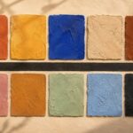
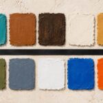
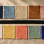
The Earthroot palette — five tones, in order
Earthroot is built from five tones, layered tonally so that no single colour dominates the room. The order matters: each tone sits in a specific role.
1. Terracotta (the anchor)
Warm, baked clay — somewhere between a Tuscan rooftop tile and a Mexican pot. This is the colour that defines the palette and the one that should appear most prominently: in wall paint, in a large textile, in a ceramic vessel, or in the dominant tone of the main piece of art on the wall.
2. Burnt sienna (the depth)
Darker, slightly redder, slightly more saturated. Sienna is the shadow tone of the palette — used in smaller doses to give the room visual depth. A single sienna throw, a clay-coloured pot, the darker tones inside a mudcloth pattern.
3. Ochre (the warmth)
Yellow-gold earth. Ochre lifts the palette and prevents it from reading too red. Used in a single rug, in cushion piping, in the warm centre of a brass lamp shade, ochre is the colour that keeps the room feeling like late afternoon rather than dusk.
4. Warm cream (the breath)
Unbleached linen, oat, raw silk. The cream tone is what gives the room room. Walls, large upholstered pieces, and the broad expanses of bedding or curtains sit best in this tone. Without enough cream, an Earthroot room becomes heavy.
5. Brown leather and aged brass (the materials)
Not strictly a colour, but the natural-material accents that complete the palette. A brown leather pouf or chair. Brass picture frames, brass drawer handles, a brass-base lamp. These materials warm slowly over time and they make the entire palette read as lived-in rather than designed.
How Earthroot differs from indigo afrocentric decor
If you have read our indigo decor guide, the contrast will be clear. Indigo is cool, contemplative, and reads slightly formal. It works beautifully in rooms with good light and crisp linen. It can feel cold in rooms with low natural light or warm flooring.
Earthroot is warm, grounded, and reads slightly more casual. It works in rooms with limited natural light, in rooms with warm wood or terracotta flooring, and in rooms that other people use as much as you do. Where indigo asks the room to be still, Earthroot asks the room to be welcoming.
Both palettes share the same underlying afrocentric vocabulary — heritage textiles, hand-made ceramics, dignified figurative art. The difference is temperature, not philosophy. Many rooms work best with one palette in winter-facing spaces and the other in summer-facing spaces of the same home.
Rooms Earthroot works best in
North-facing living rooms
North-facing rooms receive cooler natural light and can feel grey or shadowed with cool palettes. Earthroot compensates: terracotta walls and warm cream upholstery push the temperature of the room back into the warm range, so the light stops feeling like a problem.
Bedrooms in winter climates
Bedrooms in cold-winter homes need to read warm to feel restorative. An Earthroot bedroom — clay-coloured walls, oat linen bedding, a single sienna throw, brass bedside lamp — does this without leaning on heavy maximalism.
Small homes and studio apartments
Earthroot is unusually well behaved in small spaces. Because the entire palette is tonal — variations of warm earth — it creates a sense of continuity that makes small rooms feel larger. Indigo, by contrast, can divide a small room into hot and cold halves if not styled carefully.
Rooms with existing warm wood
If you already have walnut floors, oak built-ins, or warm-stained pine furniture, Earthroot picks up the tones of the wood and extends them upward into the textiles and walls. Indigo fights warm wood unless you commit to it fully.
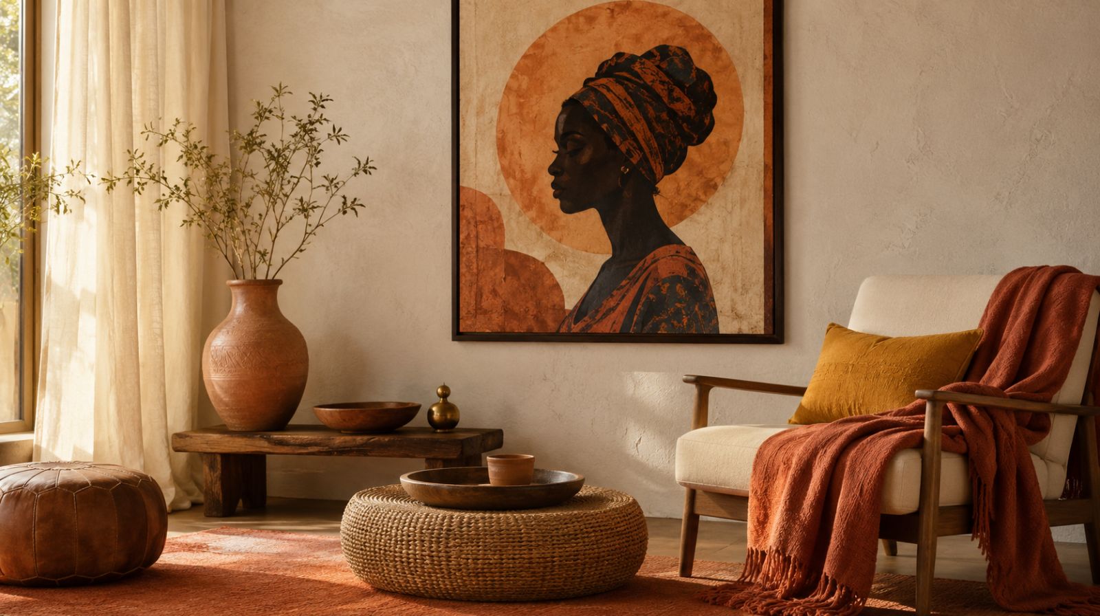
The wall art that completes the Earthroot palette
Wall art is the easiest place to begin if you are not ready to repaint or replace furniture. A single piece in the Earthroot palette will quietly shift the temperature of an entire room.
From our own shop, the Africa Map abstract print sits naturally inside this palette. The map is rendered in warm clay and cream tones, designed specifically to pair with terracotta and ochre interiors without competing with them. It works above a console, in an entryway, or as the anchor piece in a small reading corner.
For figurative art in the same palette, the Afrocentric Wall Art Set uses the same warm tonal family — terracotta, cream, soft clay — across all three pieces. Hung as a trio above a sofa or bed, it provides the cultural anchor that the rest of the Earthroot palette builds around.
If you want to extend the palette into botanical wall art rather than figurative, the Afrocentric Botanical Trio applies the same earth tones to plant subjects, giving you a calmer entry into the palette for rooms where figurative art does not fit.
A four-piece starter kit in terracotta Afrocentric decor for an Earthroot room
If you want to introduce the palette without redoing a whole room, this is the smallest meaningful version of it.
- One terracotta textile. A throw, a rug, or a pair of cushions in baked clay tones. This is the colour that names the room.
- One ochre or sienna accent. A single ochre cushion, a sienna vase, or a sienna lamp shade. One piece, not three.
- One warm cream large piece. Linen curtains, a cream throw blanket, or an oat-coloured upholstered chair. The cream gives the warm tones somewhere to land.
- One piece of wall art. A single figurative or abstract piece in the same earth-tone family, scaled to dominate one wall. This is the cultural anchor.
With just these four elements, the room reads as Earthroot. Add brass and brown leather slowly over time.
Mistakes that flatten an Earthroot room
- Too much terracotta. When the anchor colour appears on the walls, the rug, the sofa, and the curtains, the palette stops reading as warm and starts reading as monotone. Restrict terracotta to two surfaces per room.
- Cool white walls. Bright white walls against Earthroot textiles create a chalky, mismatched feeling. Choose a warm off-white or soft clay wall paint instead.
- Silver or chrome metals. Cool metals fight the entire palette. Switch to brass, bronze, or warm matte black.
- Cool-temperature light bulbs. 4000K daylight bulbs make an Earthroot room look grey and tired. Use 2700K warm-white bulbs instead.
- Pure black accents in large quantities. Earthroot uses warm matte black sparingly. A whole black bookcase or black sofa pulls the warmth out of the room.
When to choose Earthroot over indigo
As a rough decision rule, choose Earthroot if your room has limited natural light, warm wood floors, or a primary use that involves family and guests. Choose indigo if the room has abundant cool natural light, white or pale floors, and a primary use that is contemplative — a study, a primary bedroom that is yours alone, or a quiet reading space.
Many homes benefit from running both palettes in different rooms. An indigo primary bedroom and an Earthroot living room is a pairing we have seen work consistently — same family of afrocentric heritage references, two different temperature stories, both equally luxurious.
Frequently asked questions
Is terracotta still trending in 2026?
Yes, and the data supports this strongly. Pinterest interest in terracotta-led interiors has been rising steadily through 2025 and into 2026, and the broader move away from cool grey minimalism continues to push warm earth palettes upward. Terracotta is not a short-cycle trend; it has been a recurring decor anchor for over a decade and the current wave reads as a structural shift rather than a passing moment.
Can I combine Earthroot with indigo in the same room?
Yes, but carefully. The combination works best when indigo appears in a single, contained piece — one cushion, one piece of art, one ceramic — against a fully Earthroot base. The mistake is treating the two as equal halves; the room then reads as visually divided. Earthroot should always dominate, with indigo as a single quiet accent.
What wall paint colours work for an Earthroot room?
Look for warm off-whites, soft clay tones, and pale terracotta. Specific paints in this family include warm putty, baked plaster, soft Tuscan clay, and aged linen. Avoid bright whites, cool greys, and any colour with a blue or green undertone. A small paint sample tested on the wall in both daylight and evening light is the only reliable way to choose.
Does Earthroot work with darker skin tones in figurative wall art?
It is an unusually flattering palette for darker-skin figurative art. The warm earth tones in the palette echo the warmth of brown and dark brown skin, creating visual continuity rather than contrast. Cooler palettes can sometimes make figurative portraits feel isolated from the room. Earthroot tends to absorb them naturally.
Is Earthroot expensive to style?
No more than any other palette, and often less. The materials at the heart of the palette — linen, terracotta ceramic, brown leather, brass — are widely available at many price points. The biggest savings come from the discipline the palette enforces: fewer pieces, each given more attention. The cost lives in considering the choices, not in the dollar value of any single item.
Related reading
- Indigo Decor: A Quiet Luxury Guide to Afrocentric Wall Art in Blue Tones
- Afro-Boho Color Palette 2026
- Afrocentric Bedroom Ideas: Warm, Calm Sanctuary Styling for 2026
- What’s Actually Trending in Global Decor in 2026: A Pinterest Data Analysis
Closing
Earthroot is, in the end, less a new palette than a quietly assembled one. Terracotta, ochre, clay, and cream have been part of afrocentric design for as long as the design has existed. What is new is treating them as a named system — one you can ask for, build toward, and recognise when you walk into another room that is doing the same thing.
If you want to begin, begin with the wall. A single piece of art in the Earthroot palette will tell the rest of the room what it is. Our shop is full of pieces designed to do exactly this work.
Shop the Essence of the Road Art collection
Essence of the Road Art on Etsy — full collection
Afrocentric Wall Art Set — Black Woman trio