Modern Cozy Living Room: Warm Afro-Neutral Wall Art That Grounds the Space
By Essence of the Road Art · Published July 2026
This article contains affiliate links. If you buy through them, we may earn a small commission at no extra cost to you. As an Amazon Associate I earn from qualifying purchases. We only feature pieces we would live with ourselves.
There is a specific frustration in trying to make a minimal room feel warm. You have done the sensible things — the neutral sofa, the clean lines, the restraint — and the room is undeniably nice. It is also a bit like a waiting area.
The instinct at that point is to add. More cushions, more objects, a second rug, something on every surface. And it does not work, because the problem was never quantity. A modern cozy living room is not a minimal room with more stuff in it. It is a minimal room built from warmer materials and warmer tones, where the largest surfaces are doing the emotional work instead of the small ones.
The largest available surface in almost every living room is the wall above the sofa. That is where this gets solved.
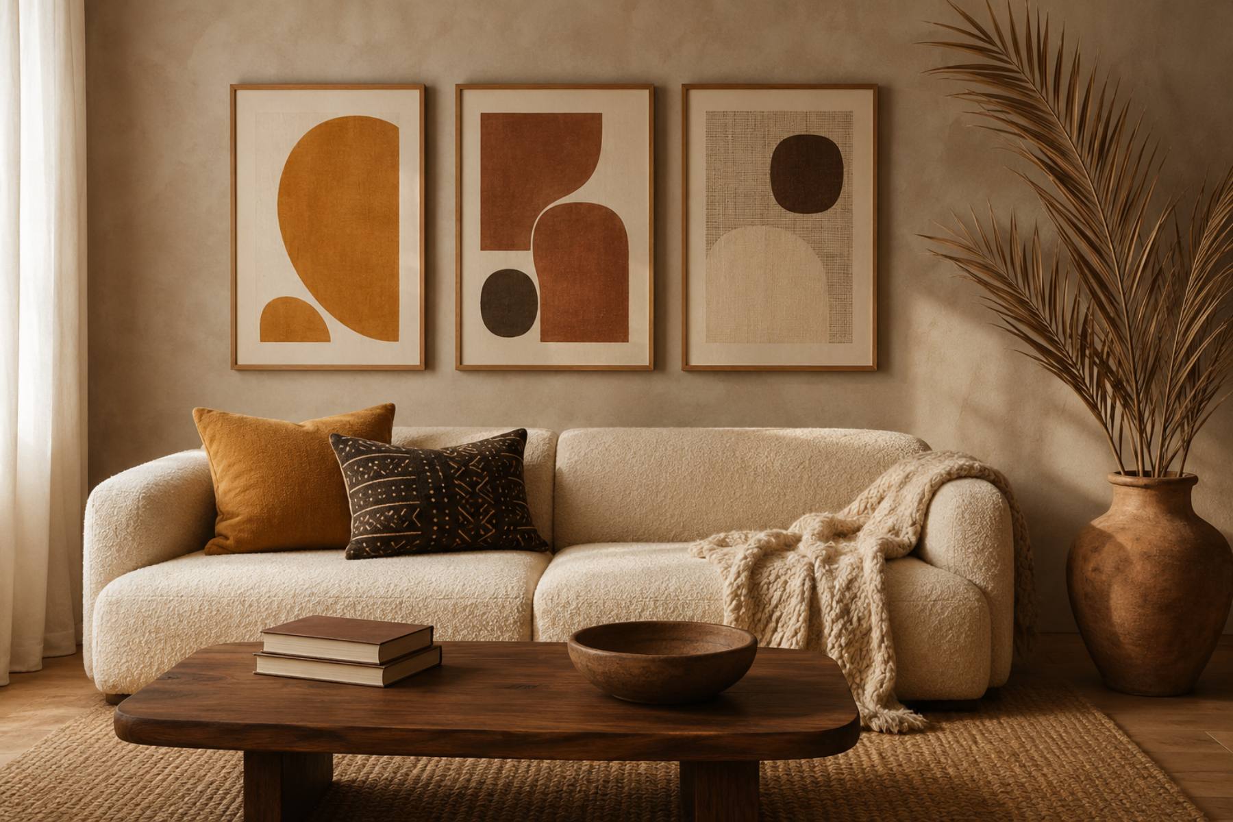
Quick answer: A modern cozy living room comes from tone and texture, not from adding objects. Warm the palette — ochre, clay, warm brown and bone rather than grey and white — introduce three natural textures (wool, jute, clay), and put large-scale warm-toned art above the sofa so the biggest surface in the room carries the warmth. Three large pieces beat seven small ones. Our Afrocentric Wall Art Set (3), Neutral Terracotta Botanical Prints is built for exactly this wall, and printing it large is what makes the room feel finished rather than decorated.
Table of Contents
Why cool minimal rooms feel cold
It is not a metaphor. It is measurable.
Grey, cool white and blue-tinted neutrals reflect light in a way the eye reads as clinical, and they offer very little tonal variation — a grey room is often five versions of the same value, which gives the eye nothing to travel across. Warm neutrals do the opposite. Ochre, clay, caramel and bone sit at different values as well as different temperatures, so a room built from them has depth even when nothing is happening in it.
Interior designers describe warm earth tones as the palette the nervous system reads as safe and grounded, and 2026 forecasts across the board have landed on the same family: terracotta, ochre, clay red, olive, raw umber, warm caramel. The industry has swung hard away from cool minimalism, and it has swung toward a palette that Afro-bohemian interiors have used all along.
The practical upshot: you do not need to abandon minimalism to get warmth. You need to change its temperature.
The three-texture rule
Cosiness is tactile before it is visual. A room with one texture repeated — all smooth, all matte, all the same weave — reads flat no matter what colour it is.
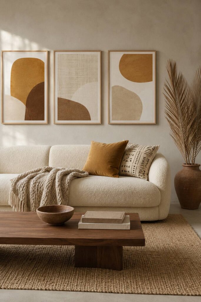
Three is the minimum, and each should be genuinely different to the hand:
Something soft and irregular. Wool, bouclé, a chunky knit throw. Deliberately imperfect.
Something coarse and natural. Jute, sisal, rattan, a woven basket. This is the texture most minimal rooms are missing entirely.
Something hard and matte. Unglazed clay, raw ceramic, carved wood. Not glass, not chrome, not high-gloss lacquer — those read cold no matter how warm the colour is.
Add a fourth if you want, but the difference between one texture and three is enormous, and the difference between three and six is almost nothing.
Big art, few pieces
This is the single most common mistake in living rooms, and it is worth being blunt about.
Small art makes a room feel smaller and busier. A wall with seven little frames on it has seven edges, seven shadows and seven decisions, and the eye cannot rest anywhere. A wall with three large pieces has three, and the room feels calmer and bigger.
The rule of thumb: your arrangement should span roughly two-thirds of the sofa’s width, and the individual pieces should be large enough that you can see what they are from the doorway.
For a standard three-seat sofa (around 200 cm) that means a total span of about 130–140 cm — so three prints at roughly 40 × 50 cm with 6 cm gaps, or two at 50 × 70 cm. Not five at A4.
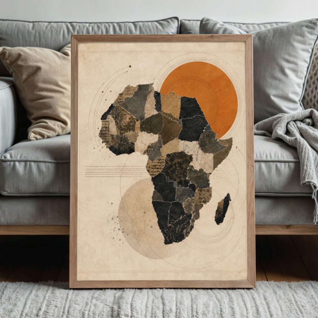
Printables are genuinely useful here for one specific reason: scaling up costs nothing. A file that ships in multiple sizes lets you print at 50 × 70 cm instead of A4 for the price of the paper, which is exactly the upgrade the room needs. Our Afrocentric Wall Art Set (3), Neutral Terracotta Botanical Prints and the Earth Tone Abstract Terracotta Set (3) both work at large scale because the shapes are simple enough not to fall apart when enlarged.
Choosing art that is warm without being loud
The brief for a modern cosy room is specific and slightly counterintuitive: the art needs to add warmth without becoming the subject of the room.
Low contrast. Ochre against bone, warm brown against cream. Avoid black-against-white graphic work, which reads as sharp and cool no matter what else is in the room.
Texture visible in the artwork itself. Grain, paper tooth, a faint woven or resist-dye pattern. Art that looks like cloth or clay reinforces the textures elsewhere; flat vector-style art fights them.
Abstract or near-abstract. Shapes, forms, botanical silhouettes. A room you sit in every evening is not the place for a piece that demands active attention.
Heritage in the pattern, not in the volume. This is the part generic warm-neutral art cannot do. An adire resist pattern or a mudcloth-derived geometry reads at first glance as texture, and on second glance as something specific. That double read is what stops a warm neutral room from looking like every other warm neutral room.
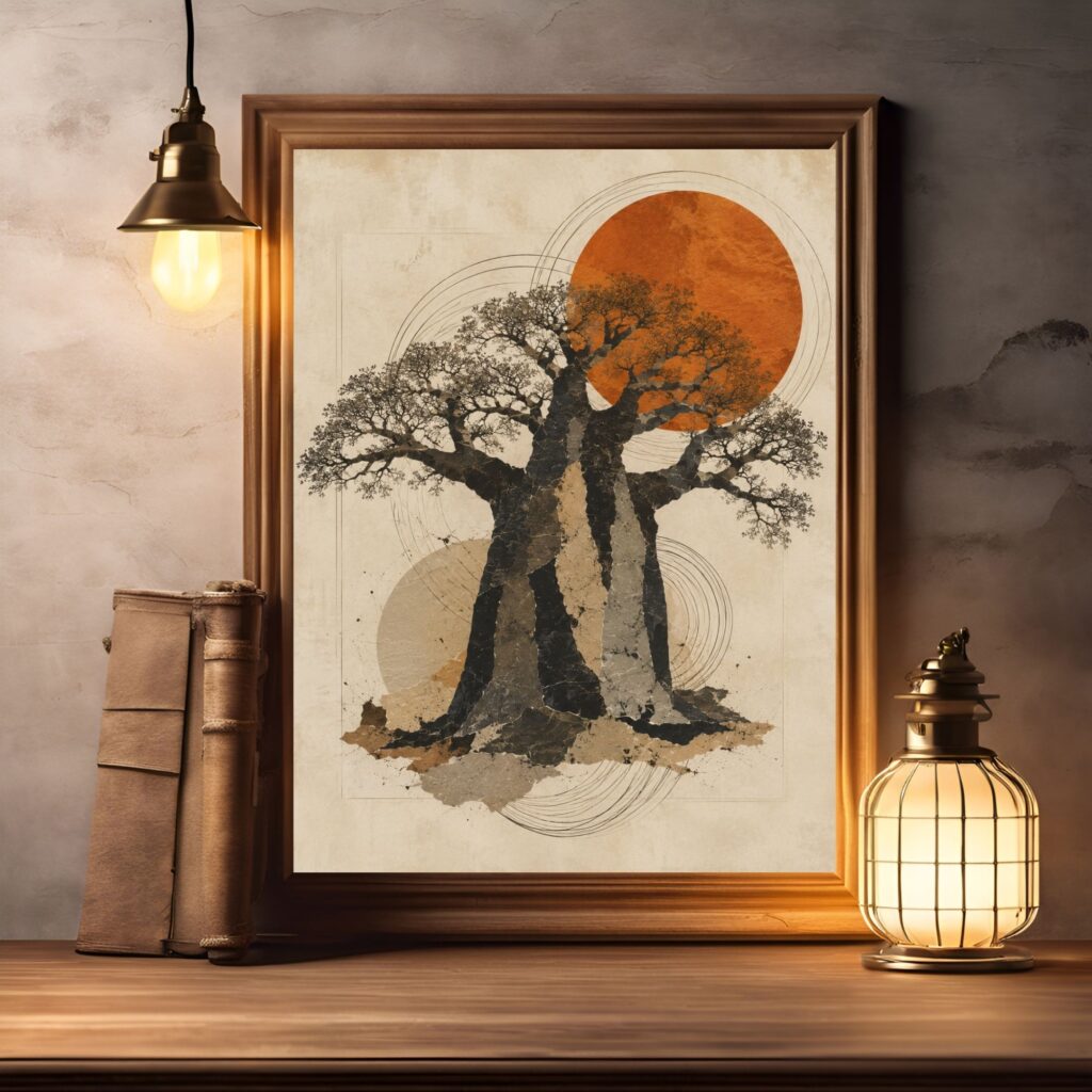
If you want one piece with slightly more presence, a Baobab Tree of Life print or the Protea Wall Art Printable in terracotta gives the wall a focal point without raising the volume.
Getting the height right above a sofa
Two numbers, and they are almost always the fix in a room that feels slightly off.
Bottom edge, 20–25 cm above the sofa back. Higher than that and the art detaches, floating in its own zone with a band of empty wall underneath. This gap is the most common reason a well-chosen set still looks wrong.
Centre of the arrangement at about 145–152 cm from the floor. Standard gallery height, and it holds unless your ceilings are unusually low.
Hang the middle piece first, work outward, and measure every gap rather than eyeballing them. In a low-contrast arrangement, uneven spacing is the thing people notice without being able to say why.
Lighting: three sources, all warm, all low
Overhead lighting is the enemy of a cosy room. One ceiling fixture flattens everything, casts hard downward shadows, and makes warm colours look muddy.
Replace it with three low sources:
A floor lamp beside or behind the sofa, angled up or diffused.
A table lamp on a side table, at seated eye level.
Something very low — a small lamp on a shelf, or candles on the coffee table.
All at 2700K or warmer. This one change does more for perceived cosiness than any piece of furniture, and it costs less than a cushion.
Dimmable bulbs are worth it if the fittings allow. A set of warm 2700K dimmable bulbs is a genuinely disproportionate upgrade for the money.
The restraint part
Everything above is additive, so here is the subtraction.
A modern cosy room has empty surfaces. At least half of every horizontal surface should be clear. The coffee table holds two things. The shelf has gaps. The mantel is not a display.
This is what separates “cosy” from “cluttered”, and it is why the wall matters so much — art carries warmth without occupying any usable surface at all. It is the only decorative layer that costs you nothing in floor space, table space or tidying.
If the room still feels cold after warm colour, three textures, big art and low warm light, the answer is not another object. It is usually the ceiling light still being on.
Frequently asked questions
How do I make a minimalist living room feel cozy without adding clutter?
Change the temperature rather than the quantity. Move the palette from grey and cool white to ochre, clay, warm brown and bone; introduce three genuinely different natural textures (wool, jute, clay); scale up the art above the sofa so the largest surface carries the warmth; and replace overhead lighting with three low warm-toned sources. All four moves add depth without adding objects, and the room stays as uncluttered as it was.
What size art should go above a sofa?
The arrangement should span roughly two-thirds of the sofa’s width, with the bottom edge 20–25 cm above the sofa back. For a 200 cm three-seat sofa that means a total span of about 130–140 cm — three prints around 40 × 50 cm, or two at 50 × 70 cm. Small frames scattered across a large wall are the most common cause of a room feeling busy and unfinished at the same time.
What colours make a living room feel warm?
Ochre, clay, terracotta, warm brown, caramel and bone, with olive as a secondary. What matters as much as the hue is the range of values — a warm room needs light, mid and deep tones present, or it flattens out. Avoid cool greys, blue-toned whites and stark black-and-white contrast, all of which read as sharp regardless of how much texture you add around them.
Does warm neutral art go out of style?
Less than most alternatives, because it is built on the same earth-derived palette that recurs across cultures and decades rather than on a specific trend cycle. The version that does date is the very flat, very graphic take — thin-line abstracts in beige that were everywhere in the early 2020s. Art with visible texture, and with pattern rooted in something real like adire or mudcloth, ages considerably better because it has a reason to exist beyond the palette.
Can I mix warm neutral art with a grey sofa I already own?
Yes, and it is the most common version of this problem. Do not fight the sofa — bridge it. Put a warm-toned throw and one warm cushion on the grey sofa, use a jute or wool rug in a warm tone underneath, and hang art with enough ochre and clay in it to pull the eye. Grey reads as a neutral background rather than as a cool statement once it is surrounded by warmth. Replacing the sofa is rarely necessary.
Related reading
- Afro-Bohemian Decor 101: the foundational formula
- The Afro-Boho Colour Palette for 2026, with hex codes
- Fall Bedroom Decor Ideas: an Afro-boho gallery wall above the bed
- Dining Room Decoration Ideas: an Afrocentric gallery wall above the sideboard
- Find Your Afrocentric Home Style — take the quiz
Closing
The gap between a nice minimal room and a room you want to sit in is smaller than it feels. It is a palette shift, three textures, one properly sized wall, and turning the ceiling light off.
Of those, the wall is the one that changes the room the moment it goes up. Start with the Afrocentric Wall Art Set (3), Neutral Terracotta Botanical Prints, printed larger than feels natural, and see how much of the rest you still need afterwards. Usually it is less than you expected.
Shop the Essence of the Road Art collection
- Essence of the Road Art on Etsy — full collection
- Afrocentric Wall Art Set (3), Neutral Terracotta Botanical Prints
- Afrocentric Wall Art Set (3), Earth Tone Printable, Abstract Terracotta, Decorative Map of Africa
- Afro Boho Wall Art Set (3), Neutral Botanical Prints, Black Beige Printable Decor
- Protea Wall Art Printable, King Protea Print, Terracotta Earth Tone
- Baobab Tree of Life Print, African Wall Art, Earth Tone Boho Decor