Fall Bedroom Decor Ideas: An Afro-Boho Gallery Wall Above Your Bed
By Essence of the Road Art · Published July 2026
This article contains affiliate links. If you buy through them, we may earn a small commission at no extra cost to you. As an Amazon Associate I earn from qualifying purchases. We only feature pieces we would live with ourselves.
Every September the same thing happens. You search for autumn inspiration and get back an avalanche of pumpkins, plaid, and little wooden signs telling you to be thankful. It is fine. It is also not your house.
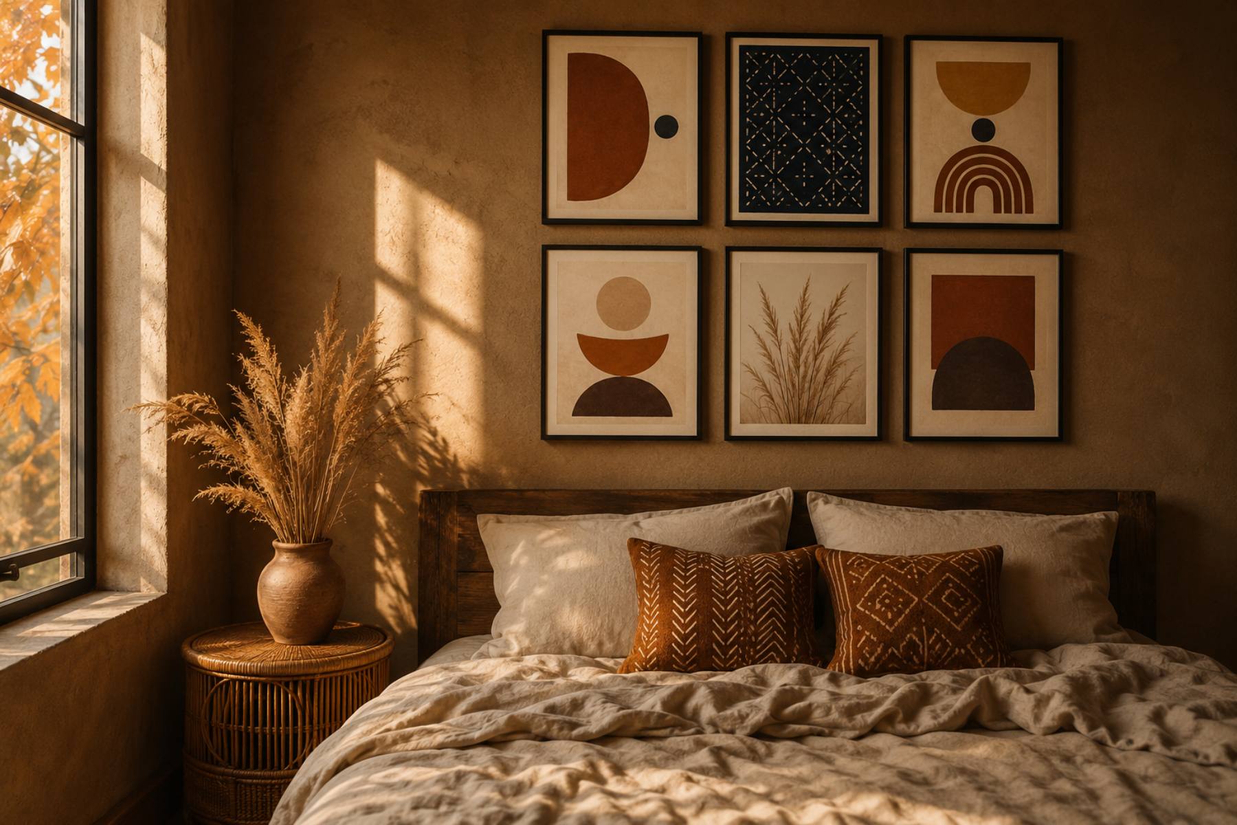
The good news is that autumn’s actual colour story — burnt terracotta, ochre, clay red, rust, warm caramel — is the same palette that has been running through Afro-bohemian interiors all along. You are not adopting a season. You are having a season that already agreed with you. Which means the best fall bedroom decor ideas for a home like yours are not about adding props. They are about turning up the warmth you already own, and putting it where the eye lands first: the wall above the bed.
Quick answer: The simplest of all the fall bedroom decor ideas is a six-piece gallery wall above the bed in autumn earth tones — burnt terracotta, ochre, rust and clay, with indigo as the accent rather than the base. Skip pumpkins and orange entirely; instead use warm abstract shapes, adire and mudcloth-inspired pattern, and dried botanicals. Printables make this almost free to change seasonally: our Afrocentric Wall Art Set (3), Neutral Terracotta Botanical Prints is the fastest starting point, and you can print it at any size you like the same afternoon.
Table of Contents
Why autumn and Afro-boho are the same palette
This is worth saying plainly because it changes how you shop.
Look at any 2026 interior colour forecast and you will find the same short list: terracotta, ochre, clay red, rust, raw umber, warm caramel, olive. Designers describe these as the tones the nervous system reads as safe and grounded — warm, low-contrast, easy on the eye after a long day.
Now look at an Afro-bohemian room. Terracotta. Ochre. Clay. Indigo. Warm wood, rattan, jute, carved texture.
It is the same list. The overlap is not a coincidence; both draw from earth, clay and plant dye rather than from pigment charts. Which means for roughly three months a year, the mainstream autumn aesthetic and your aesthetic are indistinguishable — and your version has more depth, because it comes with pattern and story rather than seasonal novelty.
If you want the full palette breakdown with hex codes, we cover that separately in our Afro-boho colour palette guide. Here we are only concerned with getting it onto one wall.
Start above the bed, not everywhere
The wall above the bed is the highest-leverage surface in the room. It is the first thing you see when you walk in, the backdrop of every photo, and the only large blank rectangle most bedrooms have.
It is also the cheapest thing to change. New bedding is a hundred-plus. New paint is a weekend. A new set of prints in the frames you already own is an evening and the cost of paper.
So the rule for autumn is simple: change the art, leave everything else. If you want more warmth after that, add one textile — a mudcloth-pattern cushion or a rust throw at the foot of the bed — and stop.
The six-piece formula that actually works
Six pieces is the sweet spot above a queen or king bed. Three feels thin against the headboard width; nine gets busy above a place you are trying to fall asleep.
Here is the mix we use:
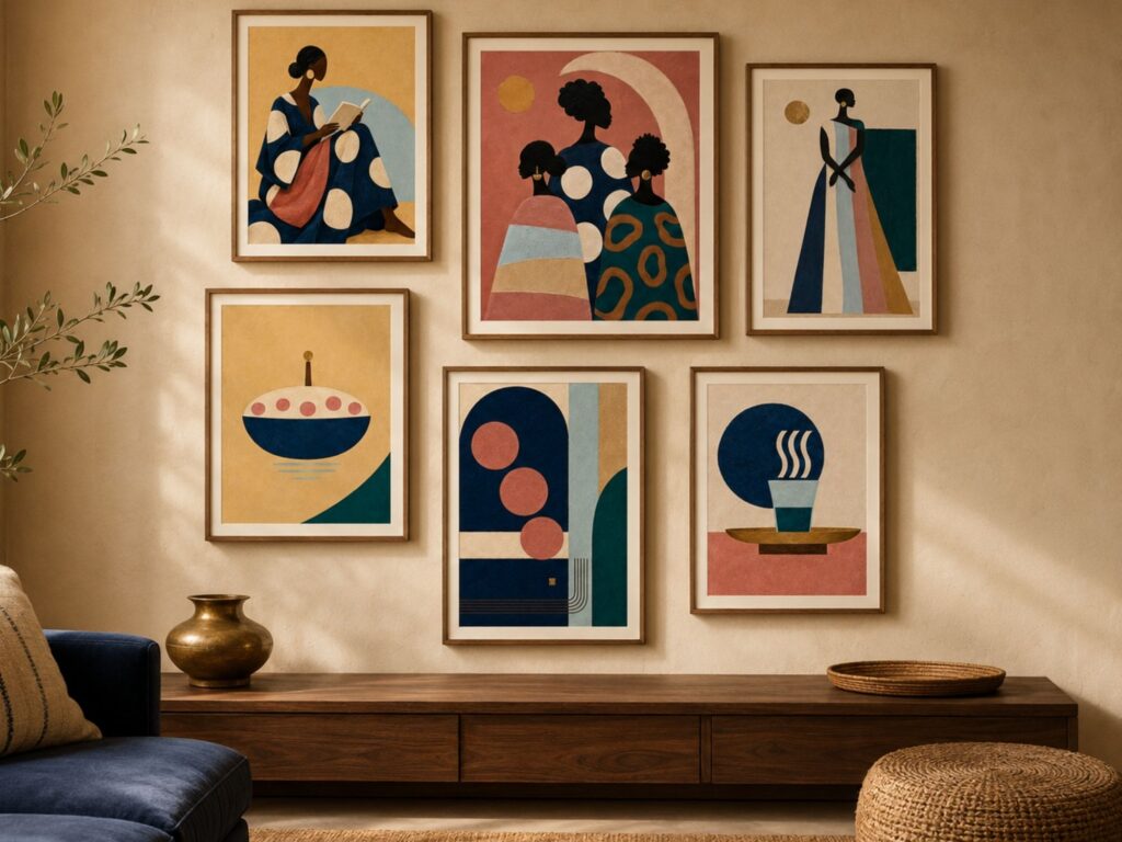
Two anchor pieces. The largest two, hung centrally. These carry the deepest colour — burnt terracotta or a warm rust field. Abstract shapes, not detail.
Two pattern pieces. This is where the heritage lives: an adire indigo-resist motif, a mudcloth geometric band, or a kente-derived stripe abstracted down to bars of colour. Indigo works here as the cool note that stops six warm prints from turning into soup.
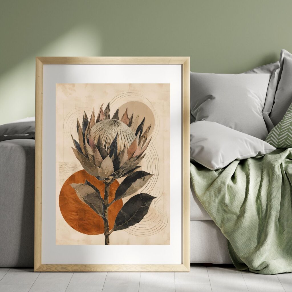
One botanical. Dried grasses, pampas, a protea, a seed head. Autumn’s actual plant life is dry and pale, not green — that is what makes it read as the season without any pumpkin doing the work.
One figure or symbol. A Black woman in profile with an autumn headwrap, a silhouette, or a single symbol. One is enough. Two competing faces above a bed feels crowded.
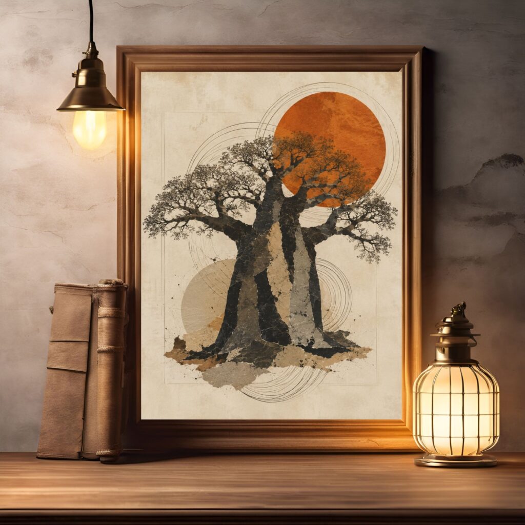
Our Afrocentric Gallery Wall Set (6), Black Women Art, Modern Eclectic Decor follows this structure if you would rather buy the balance already solved. For a warmer, more autumnal read, pair the Neutral Terracotta Botanical Set (3) with the Protea Wall Art Printable in terracotta earth tone and a Baobab Tree of Life print.
How to hang it so it looks intentional
Three measurements do almost all the work.
Bottom edge, 20–25 cm above the headboard. Any higher and the arrangement floats away from the bed and starts belonging to the ceiling. This is the single most common mistake.
Total width, no wider than the bed. The grouping should sit inside the width of the headboard or bed frame, not spill past it. Narrower reads deliberate; wider reads accidental.
Consistent gaps, 5–7 cm. Same spacing between every frame, horizontally and vertically. Uniform gaps are what make a mixed set look curated rather than collected at random.
Lay the whole thing out on the floor first, in the exact arrangement, and photograph it from above. Adjust on the floor, where mistakes cost nothing. Then cut paper templates and tape them to the wall before a single nail goes in.
Frames: match, don’t mix
For a six-piece set above a bed, use one frame finish throughout. Mixed frames work on a big open living-room wall where the arrangement is meant to look accumulated over years. Above a bed, at close range, mixing reads as noise.
Thin black frames are the safest choice against a warm wall — they give the terracotta something to push against. Natural oak or walnut is the warmer option and disappears more gently into an earthy room. Avoid gold for autumn earth tones; it tips the whole wall toward Christmas a month early.
A set of matching thin gallery frames is the one physical purchase genuinely worth making here, because you will reuse it for every seasonal swap from now on. Buy the frames once, change the paper forever.
Printing your prints so they don’t look printed
This is where most people lose the effect, so it is worth being specific.
Use matte or lightly textured paper, never gloss. Gloss reflects the bedside lamp and flattens the colour depth that makes terracotta look like clay rather than orange.
Ask for 200–250 gsm weight or heavier. Thin paper buckles inside a frame and the ripple is visible from across the room.
Check the ratio before you print. A file sized for 2:3 stretched into a 4:5 frame will crop someone’s forehead off. All our sets ship in multiple ratios for exactly this reason — pick the file that matches the frame you own rather than resizing at the print shop.
If you are printing at home, a local print shop will almost always give you better colour on earth tones than a desktop printer will. Terracotta and ochre are notoriously hard for home inkjets; deep browns come out muddy.
Layering the rest of the room, briefly
Once the wall is done, three small moves finish the season:
One textile in rust or ochre. A throw folded at the foot of the bed, or two cushions. Not both plus curtains — you are adding warmth, not upholstering.
One texture in natural fibre. Rattan, jute, seagrass. A basket beside the bed, a woven tray on the nightstand.
Warm light, low down. Swap any cool-white bulb for a warm 2700K one, and put the light at bedside height rather than overhead. Autumn light is low and golden; ceiling light is not.
That is the whole room. Wall, textile, texture, light. Everything else is optional.
What to skip
A short list, because restraint is the whole aesthetic:
- Orange. True orange fights terracotta rather than supporting it. Stay in burnt, rust and clay.
- Seasonal typography. “Hello Autumn” signage dates the room to a specific month and cannot be looked at twice.
- Faux foliage in bright green. Autumn plants are dry, pale and papery. Bright green artificial garland reads as spring with a filter.
- More than one figure. Above a bed, two portraits start looking at each other rather than at the room.
Frequently asked questions
What are the best colours for fall bedroom decor if I don’t like orange?
Stay in the warm-earth family and avoid the pure hue entirely. Burnt terracotta, clay red, rust, ochre, raw umber and warm caramel all read unmistakably as autumn without any of the brightness that makes orange difficult. Ground them with warm brown or deep charcoal, and use indigo as a cool accent to stop the palette becoming heavy. This combination is also the core Afro-bohemian palette, which is why it works year-round rather than only in October.
How many prints should go above a bed?
Six is ideal above a queen or king, arranged in two rows of three. Three works above a double or single bed. The number matters less than the total width — the arrangement should stay inside the width of the bed frame, with the bottom edge 20–25 cm above the headboard. If in doubt, use fewer and larger prints rather than more and smaller ones.
Can I use printable wall art for a seasonal refresh, or does it look cheap?
It looks exactly as good as the paper you print it on. On 200 gsm matte stock in a decent frame, a printable is indistinguishable from a bought poster — and it is the only format that makes seasonal swapping affordable, because you keep the frames and change only the paper. The way printables look cheap is thin glossy paper, wrong ratio, and mismatched frames. Fix those three things and nobody can tell.
When should I put up fall decor?
Late August to early September, before the season fully arrives. There is a psychological reason as well as a practical one: decorating slightly ahead of the weather makes the change feel chosen rather than reactive. It also means you get the full three months of it rather than putting it up in late October and taking it down four weeks later.
Do I need to change the whole bedroom for autumn?
No, and you shouldn’t. Change the art above the bed, add one warm textile, and swap the bulb to a warmer temperature. That is roughly 90% of the perceived change for about 10% of the effort. Bedding, curtains and rugs are expensive to seasonalise and rarely worth it.
Related reading
- Afro-Bohemian Decor 101: the foundational formula
- Afrocentric Wall Art for Bedrooms: A Quiet Luxury Guide
- The Afro-Boho Colour Palette for 2026, with hex codes
- What’s Actually Trending in Global Decor in 2026: a Pinterest data analysis
Closing
Autumn decorating gets a bad reputation because most of it is disposable — bought in September, boxed in November, faintly embarrassing by the second year. The version that lasts is the one built from colour and texture rather than from props, and that version happens to be the one your home was already heading toward.
Change six pieces of paper above the bed. Leave the rest alone. If you want the balance solved for you, the Afrocentric Wall Art Set (3), Neutral Terracotta Botanical Prints is the piece we would start with — warm, quiet, and just as at home in February as it is in October.
Shop the Essence of the Road Art collection
- Essence of the Road Art on Etsy — full collection
- Afrocentric Wall Art Set (3), Neutral Terracotta Botanical Prints
- Afrocentric Gallery Wall Set (6), Black Women Art, Modern Eclectic Decor
- Protea Wall Art Printable, King Protea Print, Terracotta Earth Tone
- Baobab Tree of Life Print, African Wall Art, Earth Tone Boho Decor
- Afrocentric Wall Art Set (3), Earth Tone Printable, Abstract Terracotta, Decorative Map of Africa