
How to Style Afrofuturist Wall Art at Home Without It Looking Like a Cliché
By Essence of the Road Art
This article contains affiliate links. If you buy through our links, we may earn a small commission at no extra cost to you. We only recommend pieces we would style in our own homes.
Why we wrote this
Most Afrofuturist wall art does not survive the move from screen to wall. It looks luminous on Pinterest, on a moody black background, with perfect studio mockups — and then it lands in a room with beige curtains, oak floors, and a cream sofa, and the magic evaporates. We have watched this happen often enough to want to write something honest about it.
This is a styling guide for the real situation: a normal room, a normal wall, a piece of Afrofuturist art you genuinely like, and a quiet wish that it would look as good in your house as it did in the listing photos. The good news is that it can. It just needs three things the moodboard never told you about.
📌 Quick Answer
Afrofuturist wall art works best in homes when three conditions are met: the wall color is warm and grounded (clay, deep cream, charcoal, or muted indigo — not flat white), the frames are physical and substantial (bronze, dark wood, or matte black at least 1.5 inches wide), and the room around it shares at least two of the artwork’s colors in textile or ceramic form. Most “Afrofuturist wall art looks bad in real rooms” complaints come down to a missing one of these three. Get all three right and even an inexpensive digital download print can hold a whole room together.
Table of Contents
The three conditions, expanded
We have lived with Afrofuturist wall art for two years now in three different rooms, and the same three variables keep deciding whether the piece sings or sits there awkwardly.
Wall color. Bright builder-white walls fight Afrofuturist art. The aesthetic depends on depth — cosmic blacks, deep bronzes, layered metallics — and a flat white wall reads those as gaps rather than as drama. The fix is not to repaint your whole room. Even a single accent wall in clay, deep cream (think Farrow & Ball’s Setting Plaster or Benjamin Moore’s Bleeker Beige), warm charcoal, or muted indigo will change the piece entirely.
Frame weight. A thin black IKEA frame around a piece of bronze-toned Afrofuturist art is one of the most common styling mistakes we see on Instagram. The art has visual weight; the frame needs to match it. We use bronze or dark walnut frames at minimum 1.5 inches wide, and for anything 16×20 or larger, 2 inches is better.
Color echoes. The piece will land if at least two of its colors reappear somewhere else in the room — a terracotta vase, a charcoal cushion, a brass lamp base, a piece of indigo pottery. This is not a strict rule, it is a softness rule. The eye needs an exit route.
Choosing the right palette for your room
There is no universal “best” Afrofuturist palette. The right one depends on which room you are styling, how much light it gets, and what is already living there.
- For warm, south-facing rooms with terracotta or clay tones: look for bronze + indigo + cream palettes. The bronze picks up the warmth of the existing room, the indigo cools it just enough to feel intentional, the cream gives the eye a place to rest.
- For cool, north-facing rooms with grey or blue undertones: look for deep gold + black + cosmic blue. The gold injects warmth without fighting the cool palette, and the cosmic blue echoes the room’s existing temperature.
- For minimalist, neutral, mostly-white rooms: look for monochromatic Afrofuturist work — black on cream, charcoal on linen, bronze on ivory. The dramatic neon palettes will overwhelm a quiet room rather than energize it.
- For dark, moody rooms with deep walls already: this is where the cosmic and Wakanda-royal palettes actually shine. Gold, bronze, deep red, black. The wall is doing half the work for you.
If you are unsure, the editorial Afrofuturism palette — bronze, indigo, terracotta, charcoal, cream, muted gold — works in about 80% of homes, which is why we keep returning to it.
Frames matter more than the print
This is the single most controversial thing we say about wall art, and we will keep saying it: a $20 print in a $80 frame outperforms a $200 print in a $25 frame, every time. Afrofuturist art especially needs framing that respects its weight.
What works:
- Bronze or antique brass frames — perfect for cosmic, royal, and editorial Afrofuturism.
- Dark walnut or ebony wood frames — perfect for ancestral-technology and Afro-solarpunk pieces.
- Wide matte black frames (2 inches +) — work for almost everything, especially cyberpunk and AI Afrofuturism.
- A mat of 2 to 3 inches — adds visual breathing room and makes the print look more curated.
What does not work:
- Thin metallic frames in cheap silver or rose gold — they fight the bronze tones in most Afrofuturist work.
- Frameless canvases for portrait-style Afrofuturism — the absence of a frame makes the piece float, which suits abstract work but kills figurative work.
- White frames — almost never the right choice here.
For Amazon picks, we have had good luck with the Americanflat bronze gallery frames for editorial prints, and the Mainstays wide black gallery frames for cyberpunk and AI pieces.
Gallery wall layouts that actually work
Afrofuturist art rewards gallery walls more than almost any other style we work with, because the imagery has so much internal complexity that pairing pieces well multiplies the effect. Three layouts we use repeatedly:
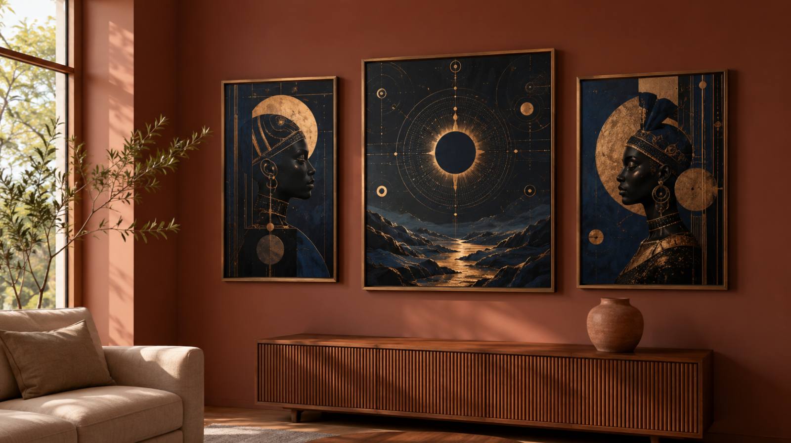
The Editorial Three. One portrait, one abstract, one celestial or map piece, all in the same palette, framed identically, hung in a horizontal row at eye level. This is what our Indigo Archives volumes are designed for. Spacing: 2 inches between frames.
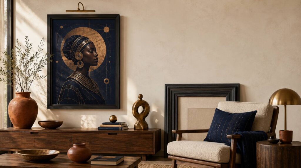
The Single Statement. One large piece (24×36 or bigger), centered above a low piece of furniture, with nothing else competing on the wall. This works best for figurative portraits or strong cosmic pieces. The trick is to leave at least 8 inches of breathing room on every side.
The Asymmetric Five. Five pieces of mixed sizes — one large, two medium, two small — arranged in a balanced but asymmetric cluster, with one anchor piece offset slightly to the left or right of center. This works for collectors who have built up pieces over time rather than buying a set.
For all three layouts, hang the center of the artwork at 57 inches from the floor, which is the standard gallery height. Most people hang too high.
The traps to avoid
A short list of the styling mistakes we have made ourselves, so you do not have to:
- Mixing too many Afrofuturist substyles in one room. A cosmic queen, a cyberpunk portrait, and an ancestral abstract on the same wall fight each other. Pick one substyle per room.
- Hanging on bright white walls without an intermediate buffer. If you cannot paint, at least use a wide cream or natural linen mat inside the frame.
- Treating the frame as an afterthought. It is half the styling.
- Buying low-resolution files. Anything under 300 DPI will look pixelated at 16×20 or larger. Always check the listing.
- Going full cyberpunk in a sanctuary room. Save the neon for a study, an office, or a teen room.
Room by room: where each style sits best
- Living room: Editorial Afrofuturism, the Wakanda-royal palette, or Afro-solarpunk landscapes. One statement piece above the sofa, or an Editorial Three across a sideboard.
- Bedroom: Soft cosmic pieces, divine-feminine portraits in indigo or cream, ancestral-technology abstracts. Avoid cyberpunk here.
- Office or study: This is where cyberpunk, AI Afrofuturism, and ancestral-technology work hardest. The energy of these substyles supports focus and creative work.
- Entryway: A single strong piece — a portrait, a map, a goddess — works better than a cluster in a transitional space.
- Dining room: Surreal Afrofuturism (Mutu-style hybrid figures) and mythic-diaspora pieces both perform well here, where the room invites conversation.
Tools and resources we use
- Frames: Americanflat (bronze), Mainstays (matte black), Etsy for handmade dark walnut.
- Wall paint: Farrow & Ball Setting Plaster, Sulking Room Pink, and Down Pipe; Benjamin Moore Bleeker Beige and Kendall Charcoal.
- Picture lights: Battery-operated brass picture lights from Amazon work surprisingly well for renters who cannot wire a wall sconce.
- Hanging hardware: 3M Command strips for renters; standard picture hooks for owners; never use one-nail hangs for anything heavier than 12×16.
- Our own Etsy collection: The Indigo Archives volumes are designed as ready-to-frame gallery sets in editorial Afrofuturist palettes. Code
ARCHIVE15gives repeat buyers 15% off.
FAQ
What is the best wall color for Afrofuturist art? Warm, grounded colors that have depth — clay, deep cream, warm charcoal, muted indigo. Bright builder-white tends to flatten the artwork. If you cannot repaint, a wide cream or linen mat inside the frame can compensate.
Do Afrofuturist prints need expensive frames? They need substantial frames, not necessarily expensive ones. A $40 wide bronze frame from Americanflat will outperform a thin $80 designer frame for almost every piece. The width and the finish matter more than the brand.
How big should the print be above a sofa? About two-thirds of the width of the sofa for a single statement piece. For an Editorial Three layout, the total width of the three frames combined should be two-thirds of the sofa width.
Can I mix Afrofuturist art with other styles? Yes — Afrofuturist work mixes especially well with Afro-bohemian textiles, mid-century modern furniture, and warm minimalist interiors. It does not mix easily with cottagecore or traditional farmhouse styles, which fight its palette.
Where should I hang the piece? The center of the artwork at 57 inches from the floor, which is standard gallery height. Most home-styled pieces hang too high — measure before you nail.
A closing note
Styling Afrofuturist wall art well is mostly an exercise in respecting what is already there — the room’s light, its existing palette, the rhythm of the wall. The art arrives with its own intensity. Your job is to give it space to land and a frame that holds its weight. Do those two things and the rest is mostly already done.
If you are looking for a ready-made set that has been designed with all of this in mind, the Indigo Archives collection is six volumes of editorial Afrofuturist gallery sets in indigo, cream, and charcoal — calibrated for real rooms, not moodboards. Repeat buyers can use ARCHIVE15 for 15% off.
Related reading from us
- What Is Afrofuturist Art? A Calm, Honest Guide (the previous post in this cluster)
- Afrofuturism vs Afrocentric vs Afro-Bohemian: A Quiet Field Guide (the next post in this cluster)
- How to Style Afrocentric Wall Art
- 15 Afrocentric Wall Art Ideas for a Modern Living Room
- Indigo Decor Afrocentric Wall Art