
Afro-Boho Color Palette 2026
— mocha mousse, terracotta, ochre, mudcloth — and a practical formula to layer them into warm, collected rooms.
Introduction
A great afro-boho color palette does not shout — it hums. It carries the warmth of clay at golden hour, the grounding of strong coffee, the softness of washed linen, the quiet pulse of a single deeper accent. In 2026, that palette has matured into the most influential colour story in warm-toned interior design, and the afro-boho home is where it lives most completely.
This guide is the full playbook. What colours belong, why they work together, and — most importantly — how to layer them into a room that reads collected rather than coordinated. We wrote it for the reader who has fallen in love with Pinterest mood boards and wants to translate them into a home that actually works.
Seven sections walk you from the anchor colour down to the finishing accents, then into a three-step formula, room-by-room swatches, and the common mistakes we see in almost every afro-boho home we consult on.
Table of Contents
The 2026 Afro-Boho Color Story
Three forces shaped this palette. Pantone’s 2024–2025 Color of the Year, Mocha Mousse, pushed warm browns back into the design conversation and unlocked a wave of mocha-adjacent neutrals in paint, textile, and decor. WGSN’s 2025–2026 palette forecasts leaned into “Future Heritage” tones — warm earths balanced by quiet deeper accents like Transformative Teal. And the cultural shift toward “quiet luxury” rewarded muted, intentional colour over saturated primary palettes.
Afro-boho sits at the centre of all three. The palette is warm, heritage-rooted, quietly layered, and wears 2026 trends naturally because the aesthetic already lived in those tones.
Mocha Mousse and Warm Neutrals — The Anchor
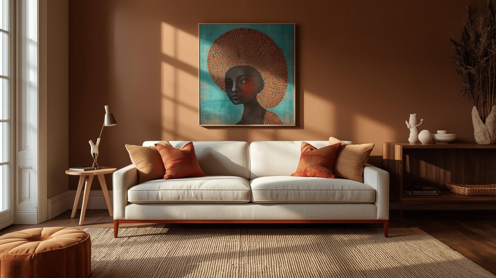
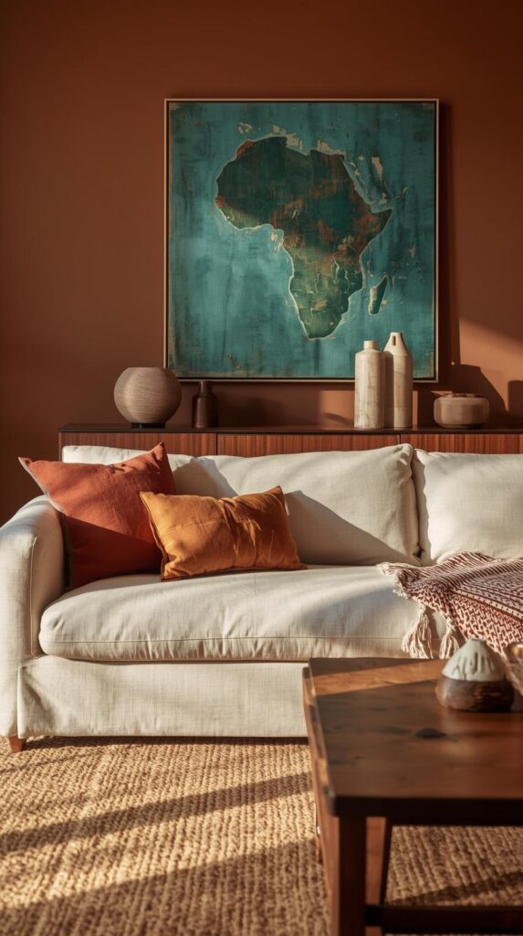
Mocha mousse is the anchor. Think of it as a warm brown with a hint of pink and a touch of grey — soft enough to sit on large surfaces (walls, sofas, rugs) without overwhelming a room, warm enough to bring the rest of the palette together. Close relatives: warm taupe, cashmere, caramel, dusty camel, soft cognac.
Use mocha mousse on one of three surfaces:
- A feature wall behind the sofa or the bed.
- A large textile — a sofa, a duvet cover, or an oversized rug.
- Wood tones — warm oak, walnut with a warm undertone, teak.
One mocha mousse surface per room is usually enough. More than two, and the palette flattens. This is one of the reasons we return to the 60-30-10 rule for afrocentric rooms when we plan a space — the anchor belongs in the sixty percent layer, not scattered throughout the room.
Terracotta, Clay, and Ochre — The Soul
Terracotta, clay, and ochre bring the warmth that makes afro-boho feel afro-boho. These are the tones of earth, of sun, of pigment. They carry the strongest cultural memory of any colour in the palette — mudcloth dye, Moroccan clay, West African ochre paints.
Use them in smaller doses:
- Accent pillows, throws, and smaller rugs.
- Ceramics — vases, bowls, candle holders.
- A painted arch behind the bed.
- Art frames or mats.
One large terracotta piece or two to three medium pieces per room. Terracotta wants to be seen; let it.
💡 Looking for printable wall art in exactly these tones? Our own Essence of the Road Art Etsy shop carries an Afrocentric Wall Art Set — 3-piece Earth Tone Collection designed in warm terracotta and clay palettes — instant digital download, print at any size.
Indigo, Transformative Teal, and Charcoal — The Depth
Every warm palette needs a moment of shadow, or it flattens. In 2026 afro-boho, that shadow is one of three tones:
- Indigo — the traditional dye tone found in African and Japanese textiles. Reads heritage and calm.
- Transformative Teal — WGSN’s 2026 forecast colour, a deep grey-teal that photographs beautifully on Pinterest and pairs effortlessly with mocha mousse.
- Charcoal — the most universal. Never fights warm neutrals, always adds gravity.
Use your chosen depth tone in exactly one or two places per room: a statement lampshade, a deep-toned art piece, a single accent chair, or a painted inset. Never three. This is where most warm palettes collapse into heaviness.
Cream, Bone, and Parchment — The Breathing Room
Without breathing room, a warm palette becomes suffocating. Cream, bone, oatmeal, parchment, and ivory are the palette’s oxygen. They belong on the pieces that occupy the most surface area but need to say the least.
Our reliable breathing-room distribution:
- Largest textile (sofa, bedding, curtains) in cream or oatmeal.
- Trim and ceiling always warmer than pure white — a cream or bone with a hint of mocha reads far more intentional than builder-grade white.
- Large ceramics in bone or ivory to soften a busier shelf.
The rule: at least forty percent of your visible surfaces should sit in the breathing-room range. Less than that and the room feels heavy.
Mudcloth and Kente — How to Layer Textiles
Textiles are where palette meets story. Afro-boho lives on the shoulders of two iconic fabrics: mudcloth (Malian bogolanfini) and kente (Ghanaian, Akan origin). Both carry real cultural weight, and both deserve respectful styling.
Practical layering rules:
- One bold textile per seating area. A mudcloth pillow or a kente throw — not both.
- Scale down patterns in small rooms. A subtle mudcloth-inspired pillow works; a full mudcloth duvet overwhelms.
- Buy from makers who honour the tradition where possible — Malian cooperatives, Ghanaian weavers, or designer brands that partner with them. Where budget is tight, well-made reproductions are fine, but acknowledge what they are.
- Rotate, do not stockpile. Two mudcloth pillows in rotation beats six at once.
The 3-Step Formula to Build Your Palette
When we build a palette for a reader’s room, we use this three-step formula:
Step 1 — Pick the anchor. One warm neutral for the largest surfaces (walls, sofa, or rug). Usually mocha mousse, warm taupe, or cream.
Step 2 — Pick the soul. One or two earth tones (terracotta, ochre, or clay) to carry the warmth. These live on accents, textiles, and ceramics.
Step 3 — Pick the depth. One darker accent (indigo, teal, or charcoal) for gravity. Just one. Used in one or two places, never three.
Total: three to four colours, carefully distributed. That is the full palette. Anything beyond four will fight itself.
📌 Save this for later — pin this palette formula to your color-inspiration board for when you are ready to plan your next room refresh.
Room-by-Room Palette Swatches
Living room: mocha mousse feature wall, cream linen sofa, jute rug with terracotta overlay, transformative teal art accent, bone ceramics.
Bedroom: warm cream bedding, oatmeal linen curtains, terracotta painted arch headboard, ochre throw at foot of bed, charcoal lamp base.
Entryway: mocha console, cream walls, ochre-framed afrocentric print, one terracotta ceramic vase, indigo catch-all tray.
Reading corner: camel leather chair, oatmeal throw, walnut side table, one ochre pillow, one deep-toned portrait print on the wall.
Dining area: oak table, cream upholstered chairs, terracotta linen runner, bone ceramics, one oversized afrocentric print in a walnut frame.
For wall art that pairs naturally with these palettes, explore our 15 Afrocentric Wall Art Ideas for a Modern Living Room — each piece was chosen with exactly these warm earth tones in mind.
Frequently Asked Questions
What is the 2026 afro-boho color palette?
The 2026 afro-boho color palette centres on warm neutrals (mocha mousse, cream, oatmeal), earth tones for soul (terracotta, ochre, clay), one deeper accent for depth (indigo, transformative teal, or charcoal), and textile layers from mudcloth and kente traditions. Three to four colours, carefully distributed.
Is mocha mousse the same as beige?
No. Mocha mousse is a warm brown with subtle pink and grey undertones — richer and more intentional than standard beige. Beige tends to read flat; mocha mousse photographs warm and reads contemporary. Pantone named it Color of the Year for 2025, and it carries into 2026 as a dominant neutral.
How do I know which deep accent colour to choose?
Look at the room’s natural light. Rooms with warm golden light (south or west facing) handle charcoal and indigo beautifully. Rooms with cooler northern light benefit from transformative teal, which neutralises cool cast. If the room is windowless or low-light, stick with charcoal — it adds gravity without competing with your lamps.
Can I mix terracotta and mocha mousse?
Yes — in fact, it is one of the strongest pairings in the 2026 palette. Mocha mousse anchors, terracotta adds warmth. Use mocha on large surfaces (walls, sofa, rug) and terracotta on smaller ones (pillows, ceramics, accent walls). Keep the ratio roughly seventy percent mocha to thirty percent terracotta.
What wall colour goes with afrocentric decor?
Warm off-whites, mocha mousse, soft clay, or warm taupe. Avoid pure white (reads clinical, fights the palette) and avoid cool greys. If you want one accent wall, mocha mousse behind the sofa or terracotta behind the bed are the safest, highest-impact choices.
How do I style mudcloth without making a room look dated?
Use it sparingly — two pillows or one throw — and pair it with modern, calm foundations like a cream linen sofa or warm cream bedding. Mudcloth reads dated only when it is overloaded or paired with other busy patterns. One piece per area, always modern surrounds.
What are the most common afro-boho palette mistakes?
Three recurring ones. First: going all-terracotta (the palette flattens without neutral breathing room). Second: mixing cool greys and warm browns (they fight). Third: using pure white instead of warm off-white (kills the warmth). Fix all three and the palette will carry itself.
Can afro-boho work in a cool-toned room?
Yes, but you will need to warm the lighting first. Cool-toned rooms benefit from 2700K bulbs, warm off-white wall colour, and at least one terracotta or ochre anchor piece. The light shift alone can change how the whole palette reads.
What paint brands carry the right colours?
Farrow & Ball, Benjamin Moore, and Dulux all have warm neutral lines with close matches to mocha mousse, terracotta, and cream. Specific names rotate by year; ask for a “warm taupe with pink-grey undertones” for mocha mousse, or bring a Pinterest swatch to the paint counter and they will match it. Always sample on the largest wall first.
How often should I update the palette?
A core palette should live at least three to five years. What changes seasonally is the accent layer — a different terracotta throw in autumn, a different indigo pillow in winter. The foundation stays; the accents rotate. That is how afro-boho stays fresh without becoming trend-chasing.
Closing Note
A palette is the room’s quiet spine. Get it right, and every other styling decision becomes easier. Get it wrong, and no amount of beautiful objects will save the feeling. The 2026 afro-boho palette rewards restraint, warmth, and one confident accent — and it wears time well, which is more than most trends can say.
Related reading on Essence of the Road Art
- 15 Afrocentric Wall Art Ideas for a Modern Living Room — to see this palette applied to real gallery walls and curated picks.
- How to Style Afrocentric Wall Art Without Making a Room Feel Busy — the full styling playbook, including the 60-30-10 rule this palette guide draws from.
Save this palette guide to your colour-inspiration Pinterest board for your next room refresh — or browse our Essence of the Road Art Etsy shop for printable afrocentric wall art designed in exactly these 2026 tones, delivered instantly as digital downloads.