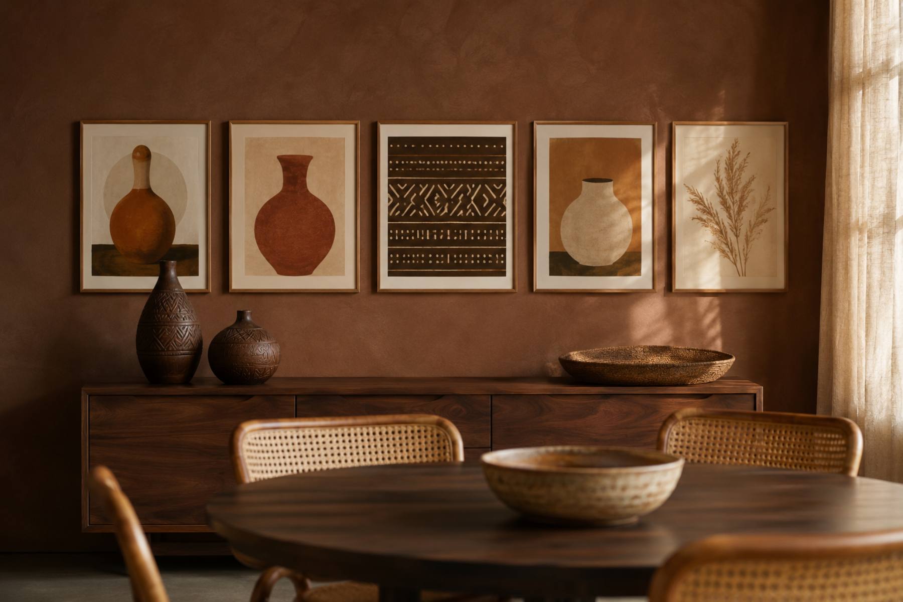
Dining Room Decoration Ideas: An Afrocentric Gallery Wall Above the Sideboard
By Essence of the Road Art · Published July 2026
This article contains affiliate links. If you buy through them, we may earn a small commission at no extra cost to you. As an Amazon Associate I earn from qualifying purchases. We only feature pieces we would live with ourselves.
The dining room is the strangest room in most homes. It gets the least daily use and the most scrutiny — sat in properly maybe twice a week, but looked at by every single person who comes over. That mismatch is why so many dining rooms end up under-decorated: it feels wasteful to invest in a room you barely occupy, right up until the moment fourteen people are in it.
Most dining room decoration ideas solve this with table styling — runners, candlesticks, a seasonal centrepiece. That is the wrong end of the room. Table styling is temporary by definition, gets cleared for every meal, and is invisible the other six days of the week. The wall is what people actually look at while they eat, and the wall above the sideboard is the one surface in the room that is doing nothing.
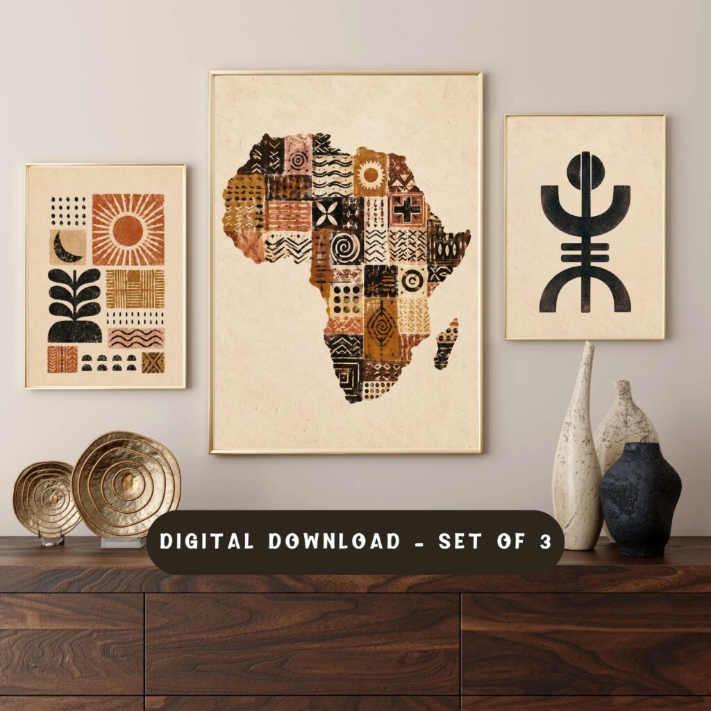
Quick answer: The most effective of all dining room decoration ideas is a horizontal gallery wall above the sideboard — five prints in a single row, in warm clay, ochre and rust, using vessel, calabash and harvest imagery rather than generic abstracts. It suits a room built around food and gathering, works whether the table is set or bare, and costs a fraction of new furniture. Our Afrocentric Wall Art Set (3), Botanical Prints, Black Woman Africa Map Poster is a natural starting trio for this wall, and printables let you scale each piece to your exact sideboard width.
Table of Contents
Why the sideboard wall, and not the table
Three reasons, in order of importance.
It is always visible. The table is cleared, set, cleared again. The wall behind and above the sideboard looks the same at 8am on a Tuesday as it does at a dinner party. Anything you put there is working full-time.
It is the sightline from the doorway. Walk into most dining rooms and your eye goes past the table to the wall behind it. That is the wall that determines whether the room reads as finished.
It has natural boundaries. A sideboard gives you a defined width to work within, which removes the hardest question in gallery-wall hanging — where does it stop? The sideboard tells you.
The horizontal rule that changes everything
Dining room walls want a horizontal arrangement, and most people hang a vertical one out of habit.
Here is why it matters. Everyone in a dining room is seated. Eye level drops by about 40 cm the moment people sit down, and the sightline flattens out. A tall stacked arrangement puts most of your art above the conversation, where nobody is looking. A single wide row sits right in the seated sightline and stays there all evening.
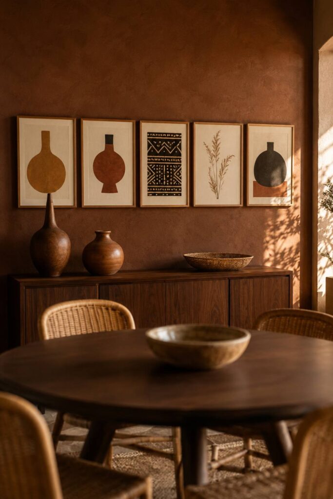
So: one row, three to five pieces, spanning roughly the width of the sideboard. Not two rows. Not a cluster. A row.
If your sideboard is wide (150 cm plus), five pieces. If it is compact, three pieces sized larger. The Afrocentric Wall Art Set (3), Africa Map Print, African Boho Decor, Terracotta Textile Poster works well as a three-piece row because the terracotta textile print gives the middle position enough weight to hold the row together.
What to put in a dining room, specifically
This is where most dining rooms go generic. People hang whatever art they have spare, and the room ends up with a beach scene or a portrait that has nothing to do with what happens there.
A dining room is a room about food, harvest and gathering. Lean into it.
Vessels and calabash forms. Clay pots, gourds, carved wooden bowls rendered as abstract shapes. These are the single most dining-appropriate motif in Afrocentric art and almost nobody uses them for this room. They read as still life without being a bowl of fruit.
Harvest botanicals. Dried grains, seed heads, grasses. Warm, papery, and directly connected to the idea of a table.
Pattern that references cloth. Mudcloth geometry, adire resist patterns, kente-derived stripes. A dining room has a lot of hard surfaces — wood, glass, ceramic. Pattern that reads as textile softens it.
One gathering image, at most. Hands, a shared table, figures in profile around something. One. This is the emotional centre of the wall and it stops working if you repeat it.
What to avoid: portraits with strong eye contact. Sitting across from a face looking directly at you for two hours is genuinely uncomfortable, and it is a mistake you only make once.
Sizing it against the sideboard
The proportions here are simple and worth getting exactly right.
Total width: 70–85% of the sideboard. Narrower than the furniture below it, never wider. A row that overhangs the sideboard looks like it was hung before the furniture arrived.
Bottom edge: 15–20 cm above the sideboard surface. Close enough that the two read as one composition. If you keep tall objects — a vase, a lamp — on the sideboard, measure from the top of those instead, and leave 10 cm of clear air.
Gaps: 5–8 cm, identical between every frame. In a single row, uneven gaps are extremely visible. Measure each one.
Lay the row out on the dining table first. It is the one room where you have a large flat surface at exactly the right width to test on.
Colour: warmth without heaviness
Dining rooms are often the darkest room in the house — frequently interior, frequently used at night. That pushes the palette in a specific direction.
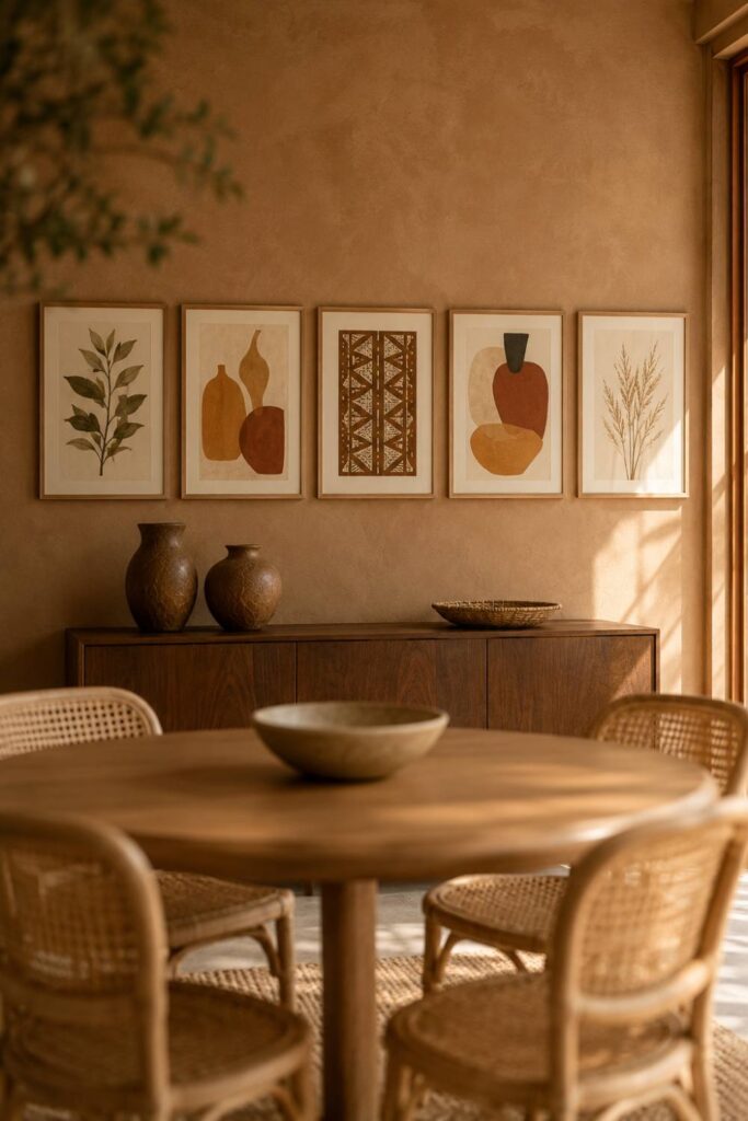
Base in warm mid-tones, not deep ones. Ochre, clay, rust, warm caramel. Deep browns and blacks that look sophisticated in a bright living room turn into holes on a dining wall lit by one pendant.
Keep cream in the mix. At least two of your prints should have generous cream or bone-white space. It bounces the light you have and stops the row from becoming a dark band.
One cool accent, no more. An indigo or deep teal note in one print gives the eye somewhere to rest. Two makes the room feel cold.
If your dining room gets good daylight you have more room to go deep — the Afrocentric Wall Art Set (3), Earth Tone Printable, Abstract Terracotta, Decorative Map of Africa handles a brighter room well. In a dim room, choose the version with more cream.
Lighting the wall properly
One change matters more than every other decorating decision in this room: get light onto the wall, not just onto the table.
A single pendant over the table lights the table and leaves everything else in shadow. That is why so many dining rooms feel like a lit island in a dark box.
Fix it with one of these:
- A pair of small table lamps on the sideboard. Easiest, cheapest, most flattering. Warm 2700K bulbs, low output. This alone transforms the room.
- A picture light above the centre print. More deliberate, needs a socket or a battery unit.
- A dimmer on the pendant, plus lamps. The dimmer stops the pendant from flattening everything else out.
A pair of small warm-toned table lamps on either end of the sideboard is the single highest-return purchase for this room.
Styling the sideboard itself
Three objects, varied heights, that is the whole formula.
Something tall — a vase with dried grasses, or a lamp.
Something round and low — a carved bowl, a clay vessel, a stack of two books.
Something horizontal — a woven tray, a runner, a shallow basket.
Group them toward one end rather than centring everything, and leave real empty space. The sideboard is a working surface; it needs room to actually hold a serving dish when it matters.
What this costs
Worth stating plainly, because dining rooms are where people assume decorating means furniture.
A five-print row, printed at a local shop on decent matte stock in simple oak frames, comes to roughly the price of one mid-range dining chair. A pair of small lamps is less again. That is the entire project.
The furniture in most dining rooms is already fine. It is the walls that are empty.
Frequently asked questions
What should I hang above a dining room sideboard?
A single horizontal row of three to five framed prints, spanning 70–85% of the sideboard width, with the bottom edge 15–20 cm above the surface. Choose imagery connected to food and gathering — vessels, calabash and clay forms, harvest botanicals, textile pattern — rather than generic abstracts. Avoid portraits with direct eye contact, which are uncomfortable to sit across from for a long meal. One large mirror is the alternative if the room is very dark, but it reflects the room back rather than adding anything to it.
How high should dining room art be hung?
Lower than you think. Everyone in a dining room is seated, which drops eye level by around 40 cm. Standard gallery height (centre at 145–152 cm) is too high here. Hang so that the centre of the row sits around 130–140 cm from the floor, or simply measure 15–20 cm up from the sideboard surface and work from there. If the art looks slightly low when you are standing, it is probably right when you are sitting.
What colours work best in a dining room?
Warm mid-tones — ochre, clay, rust, caramel — with generous cream to bounce what light there is, and one cool accent such as indigo. Most dining rooms are interior rooms used mainly at night, so very deep colours that look rich in daylight turn muddy under a single pendant. If your dining room has strong natural light you can go deeper and more saturated.
Is a gallery wall too busy for a dining room?
Not if it is a single row. The busy-ness problem comes from stacked, multi-row clusters with mixed frame styles, which give the eye nowhere to settle in a room where people sit still for a long time. One row, one frame finish, even gaps — that reads as calm and deliberate. Save the layered salon-style arrangement for a hallway or stairwell where people are moving past it.
Can I use the same art for everyday and for hosting?
That is the whole point of putting the effort into the wall rather than the table. Wall art is the layer that never needs setting up. Change the table — linens, candles, a seasonal centrepiece — and leave the wall alone. The room reads differently on a Tuesday and at a dinner party without you doing anything to it.
Related reading
- Afro-Bohemian Decor 101: the foundational formula
- The Afro-Boho Colour Palette for 2026, with hex codes
- Fall Bedroom Decor Ideas: an Afro-boho gallery wall above the bed
- Find Your Afrocentric Home Style — take the quiz
Closing
The dining room rewards a narrow effort. You do not need new furniture, a new table, or a seasonal styling routine. You need one wall to be finished and one pair of lamps so you can see it.
Start with three prints in a row above the sideboard and add two later if the wall wants them. The Afrocentric Wall Art Set (3), Botanical Prints, Black Woman Africa Map Poster is the trio we would hang first — warm, food-adjacent, and calm enough to eat under every day.
Shop the Essence of the Road Art collection
- Essence of the Road Art on Etsy — full collection
- Afrocentric Wall Art Set (3), Botanical Prints, Black Woman Africa Map Poster
- Afrocentric Wall Art Set (3), Africa Map Print, Terracotta Textile Poster
- Afrocentric Wall Art Set (3), Earth Tone Printable, Abstract Terracotta, Decorative Map of Africa
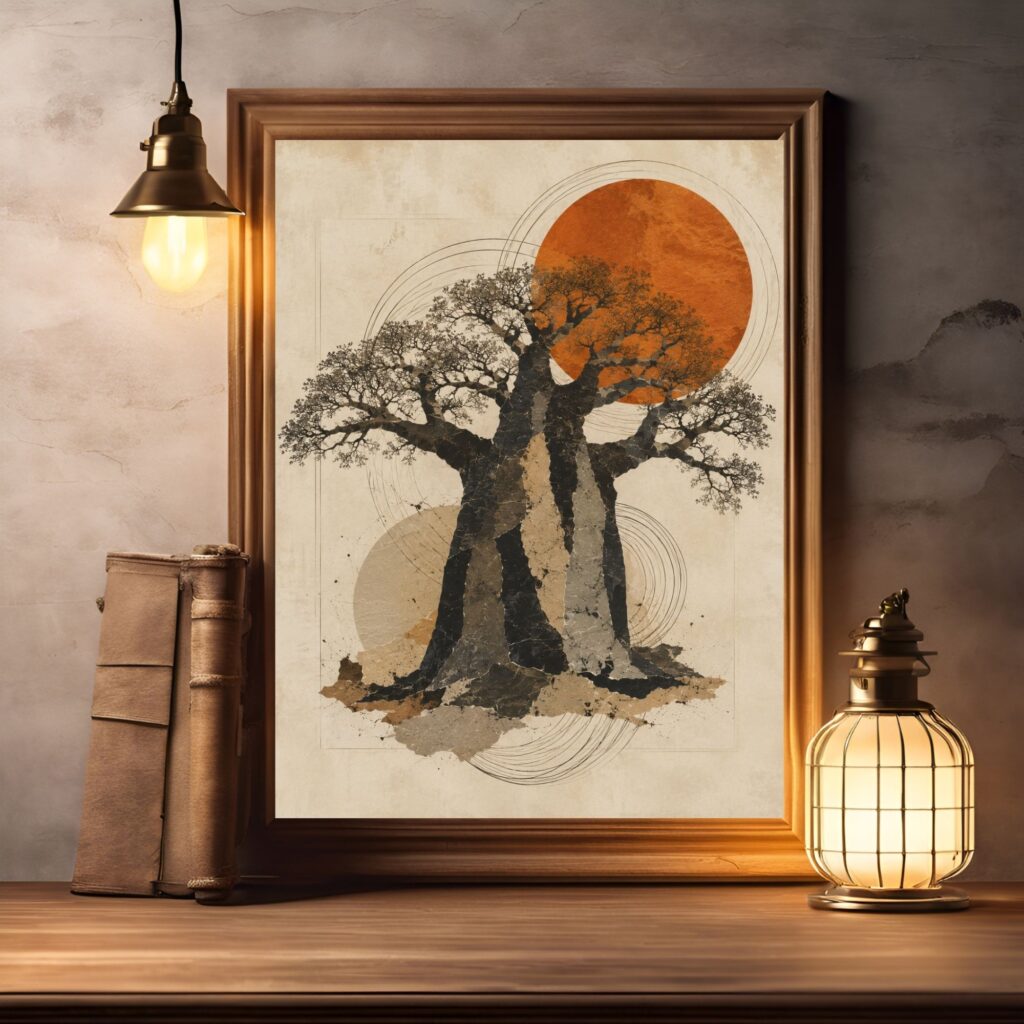
- Baobab Tree of Life Print, African Wall Art, Earth Tone Boho Decor